SIXT is a leading international car rental company with a vast global presence across 130+ countries and 2,000+ locations.
Serving millions of customers annually, the brand offers a wide range of vehicles - from economy cars to premium and luxury options - across diverse markets and customer needs.
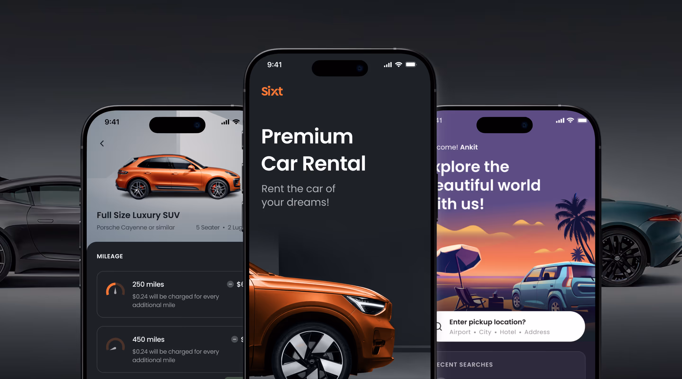
Our mission was to enhance SIXT’s responsive web and mobile app experiences by creating a modular, scalable digital platform that addresses user pain points while delivering a seamless, consistent car-rental experience across global markets.
across 130+ countries for a consistent digital rental experience at 2,000+ locations.
through a unified platform that simplified global booking and vehicle discovery.
by aligning web and app experiences into one cohesive digital ecosystem.
enabling faster rollouts and adaptability across international markets.
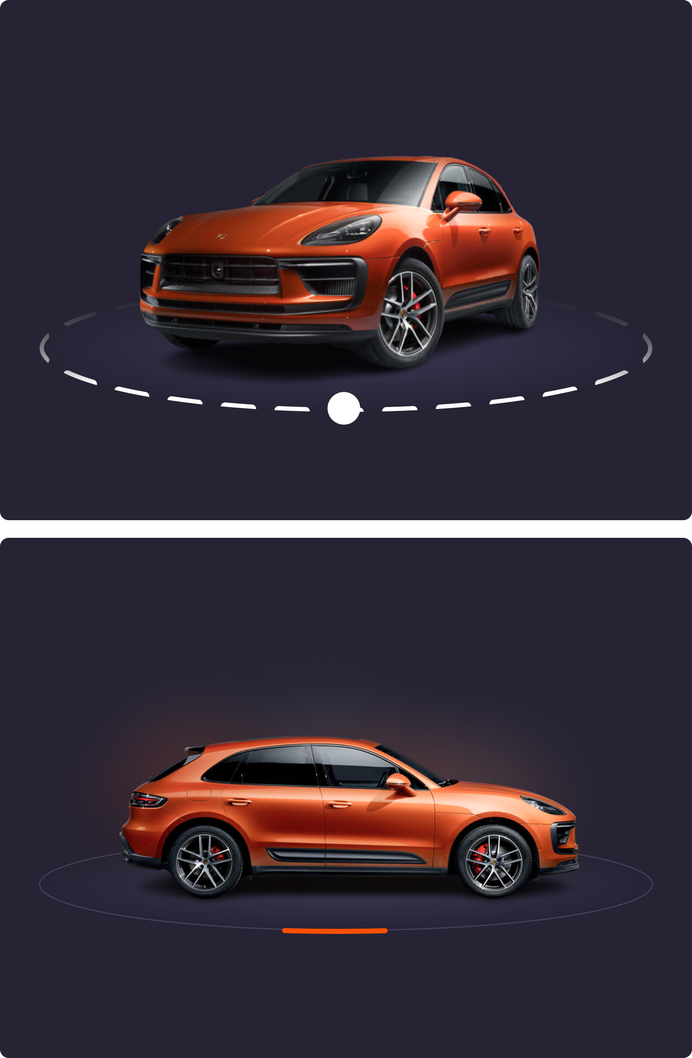
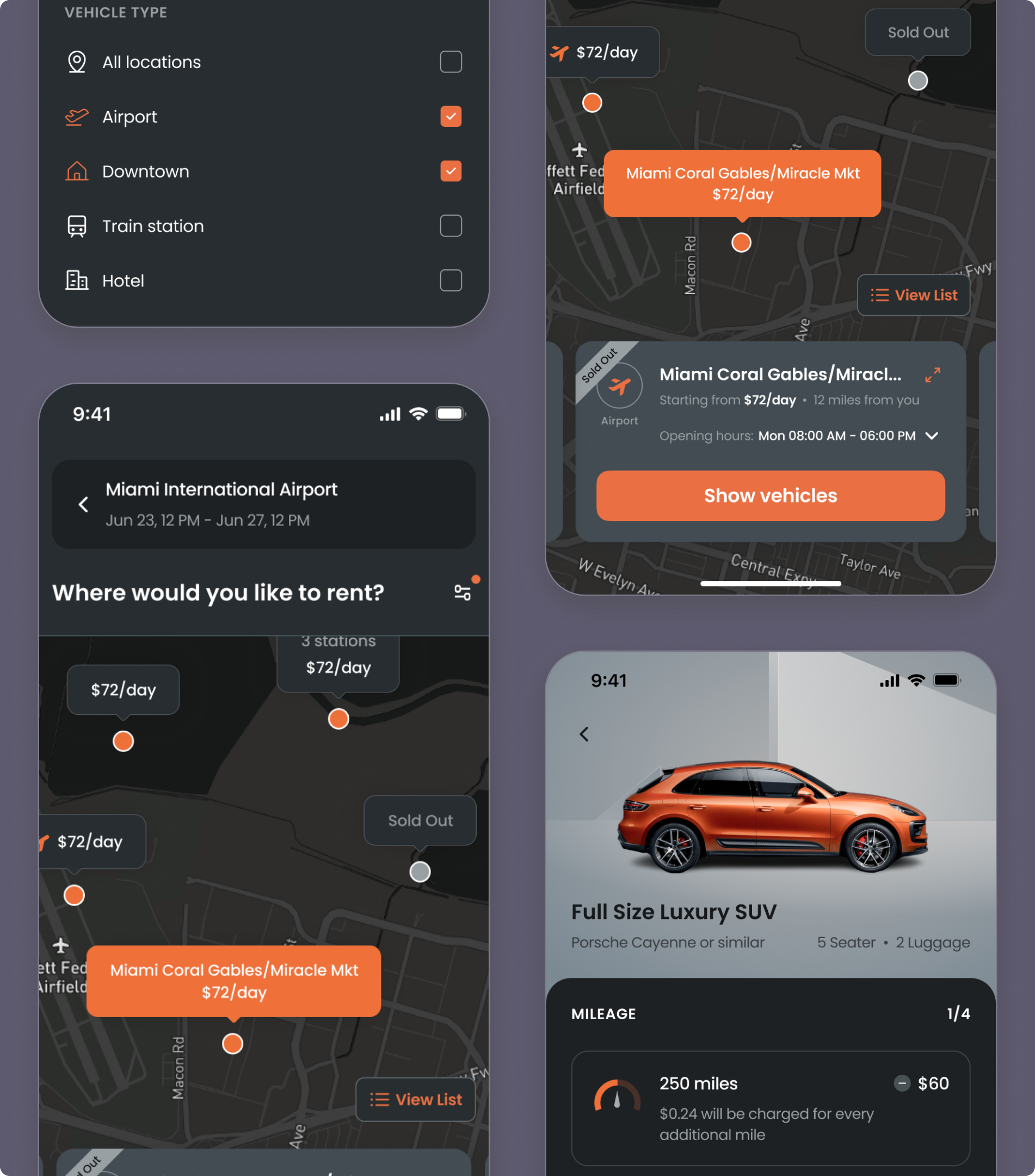
Premium car detail screen using rich visuals, bold colors, and clear hierarchy to enhance selection experience.
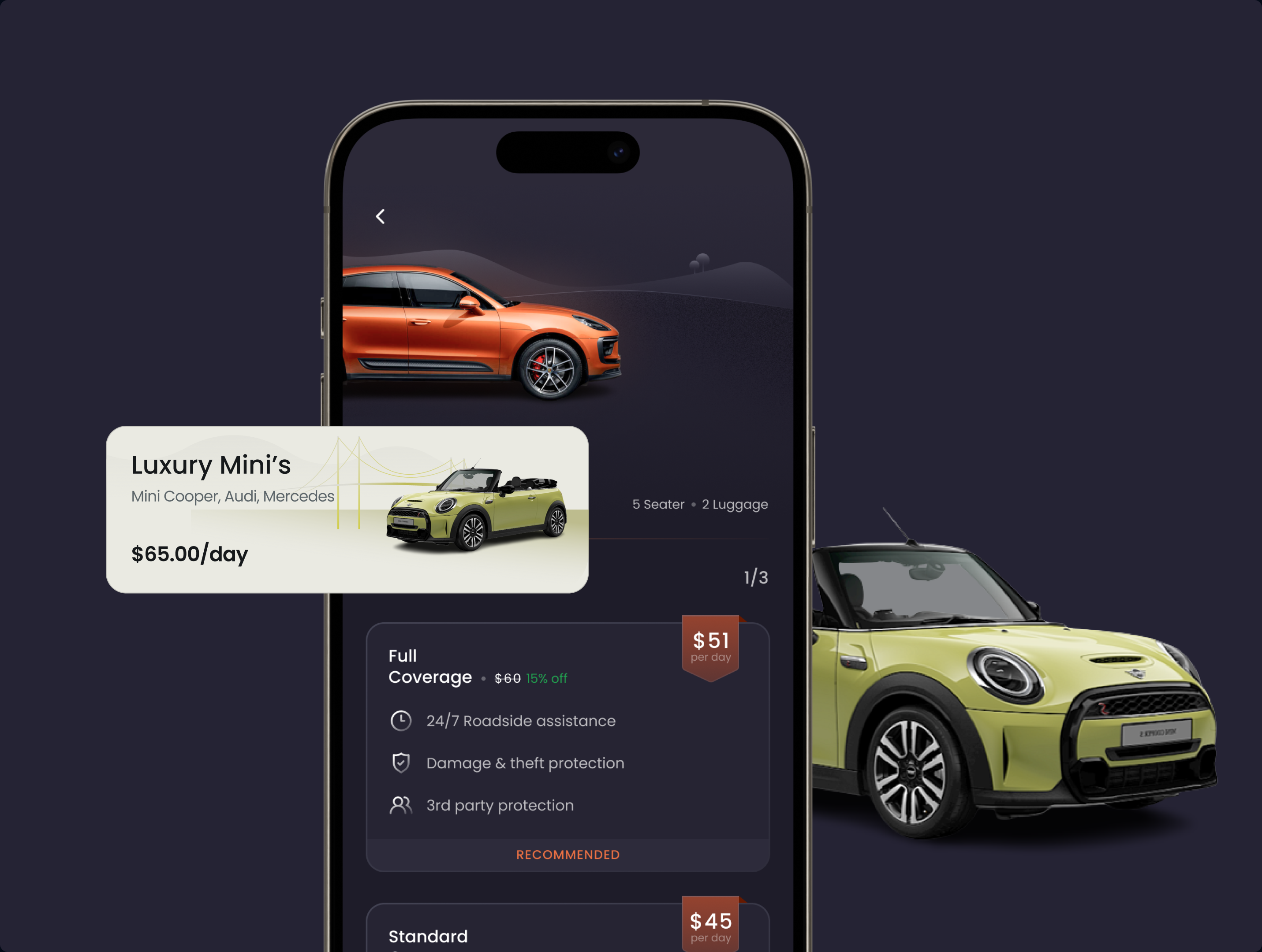
The interface prioritized clarity, legibility and hierarchy, using bold colors, white space and high-contrast typography to improve scannability and accessibility.
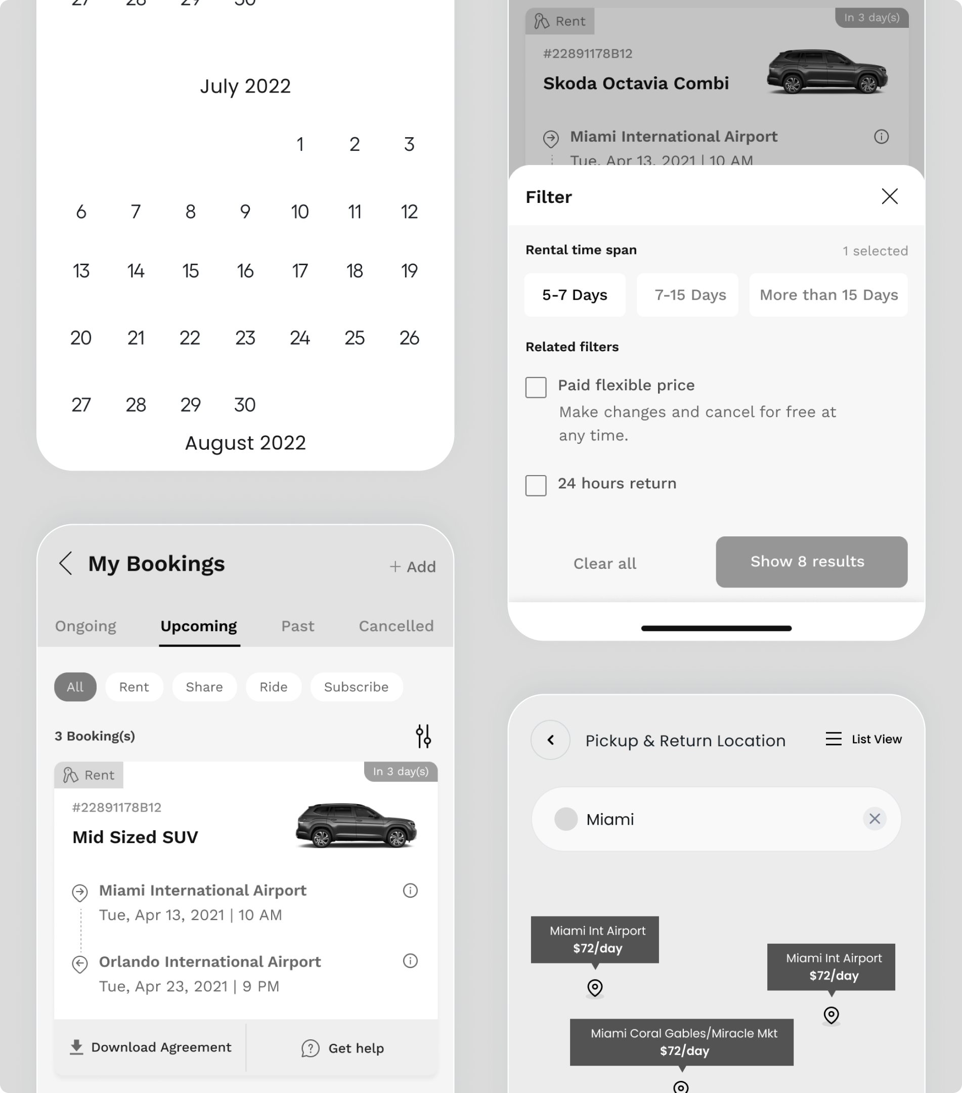
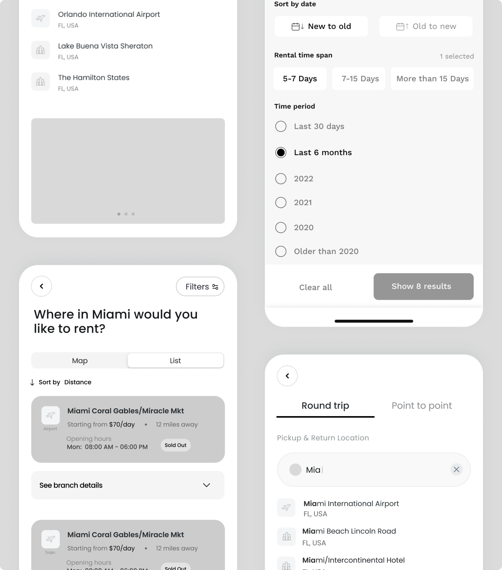
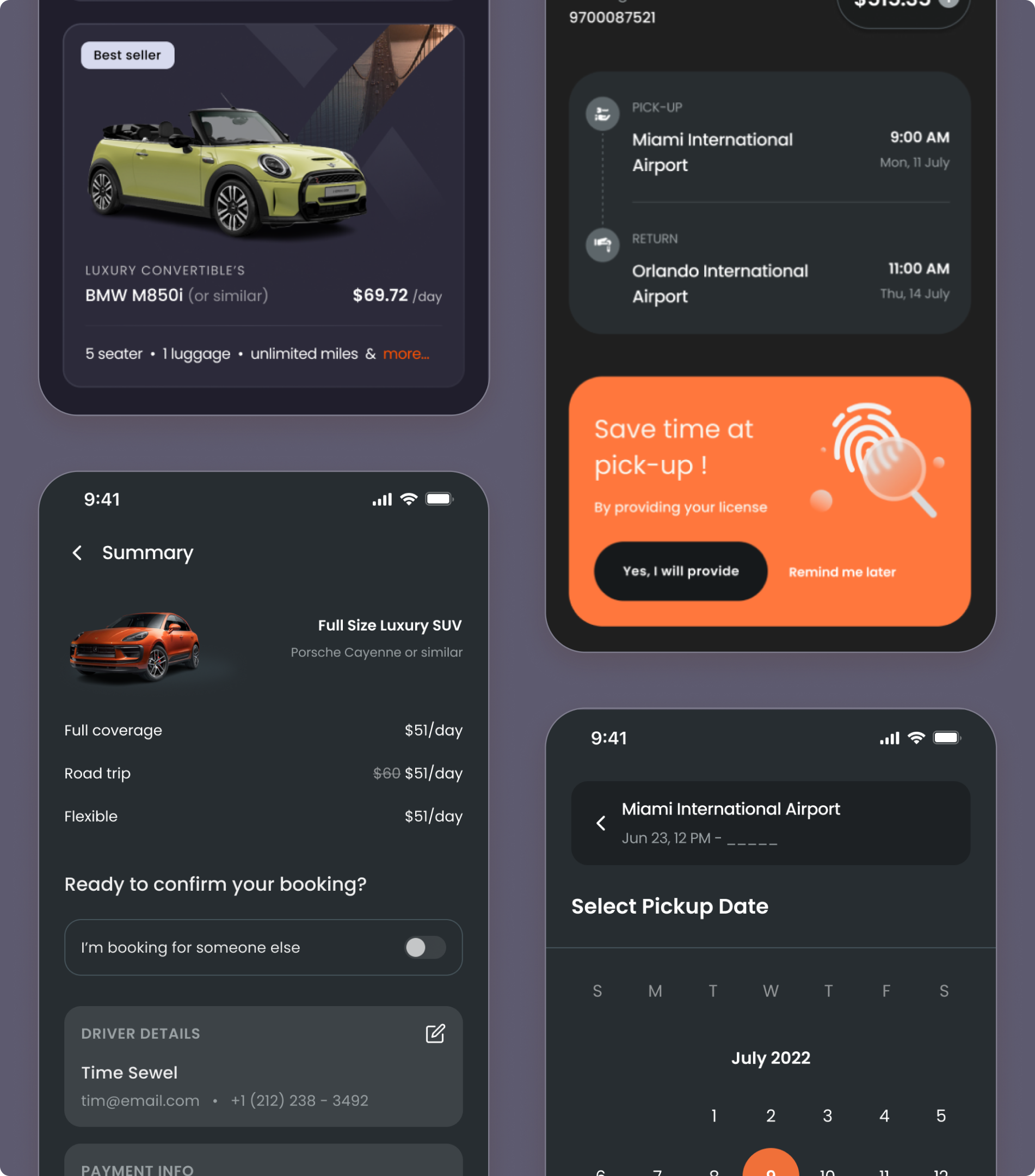
Key on-ground touchpoints were identified and redesigned to enable automation, allowing customers to complete pickups and transactions with minimal assistance.
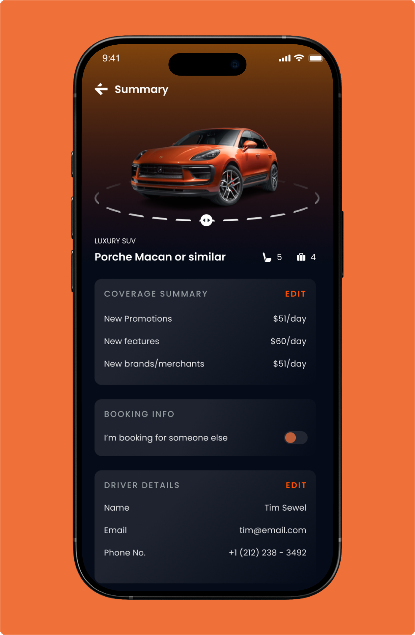
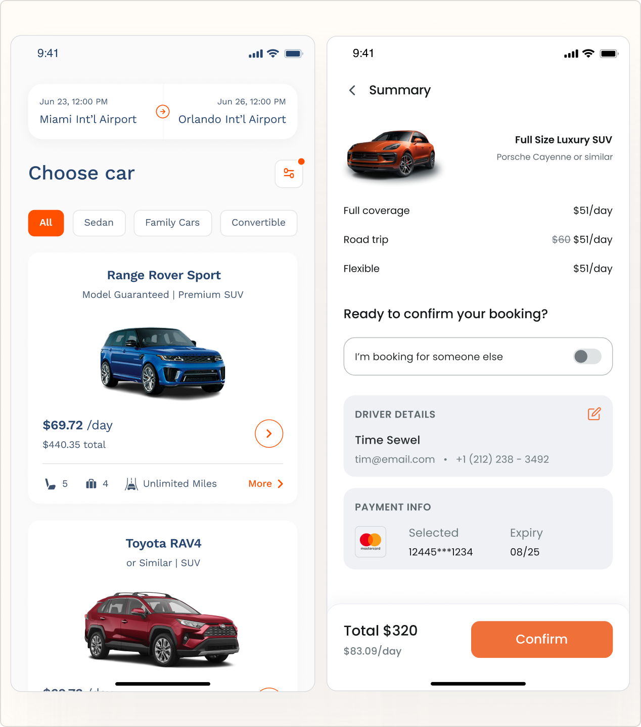
Designed rental details with coverage, summary, and driver info to reduce friction, build trust, and enable confident booking decisions.
Premium car detail screen using rich visuals, bold colors, and clear hierarchy to enhance selection experience.
Premium car detail screen using rich visuals, bold colors, and clear hierarchy to enhance selection experience.
The interface prioritized clarity, legibility and hierarchy, using bold colors, white space and high-contrast typography to improve scannability and accessibility.
The interface prioritized clarity, legibility and hierarchy, using bold colors, white space and high-contrast typography to improve scannability and accessibility.
Key on-ground touchpoints were identified and redesigned to enable automation, allowing customers to complete pickups and transactions with minimal assistance.
Key on-ground touchpoints were identified and redesigned to enable automation, allowing customers to complete pickups and transactions with minimal assistance.
Designed rental details with coverage, summary, and driver info to reduce friction, build trust, and enable confident booking decisions.
Designed rental details with coverage, summary, and driver info to reduce friction, build trust, and enable confident booking decisions.
For the car rental platform, the redesign simplified complex rental journeys, reduced dependency on customer care, and enabled seamless self-service experiences - supporting operations across a global footprint.
through seamless end-to-end rental and return journeys.
by streamlining rental, pickup, and return flows.
through intuitive, reliable self-service experiences.
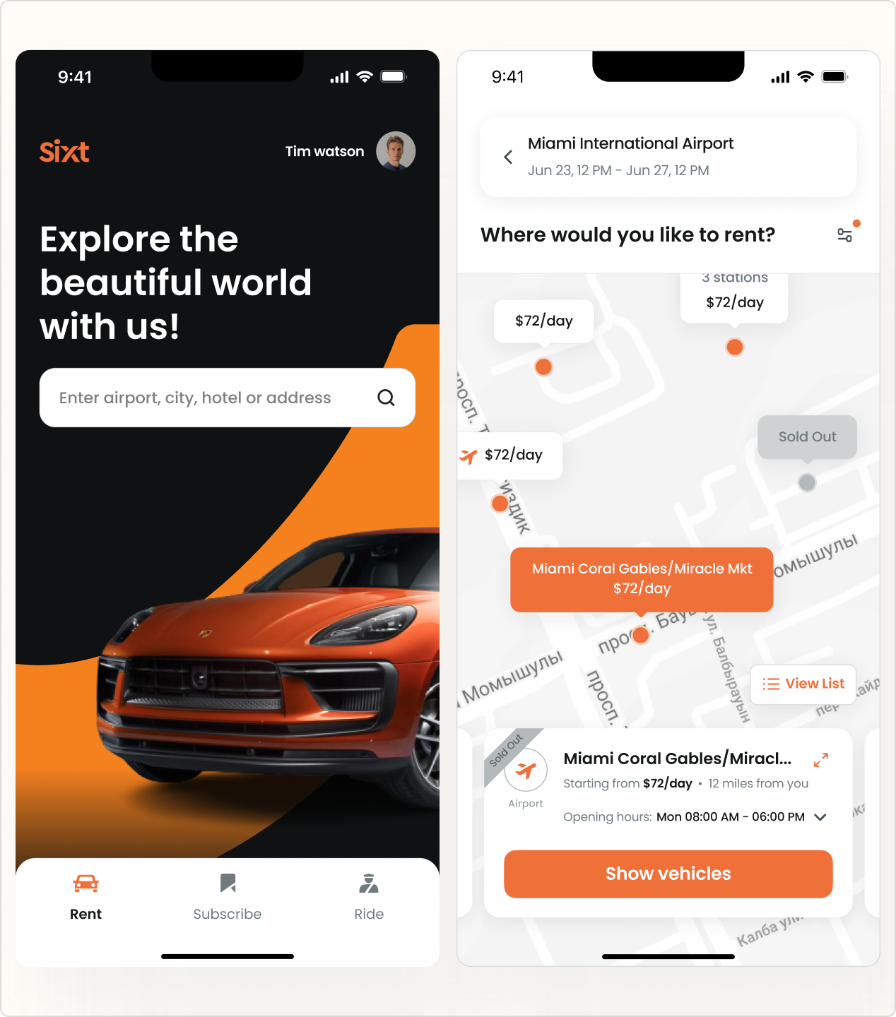
A clean, high-contrast interface with bold accent colors guiding users smoothly from search to checkout.
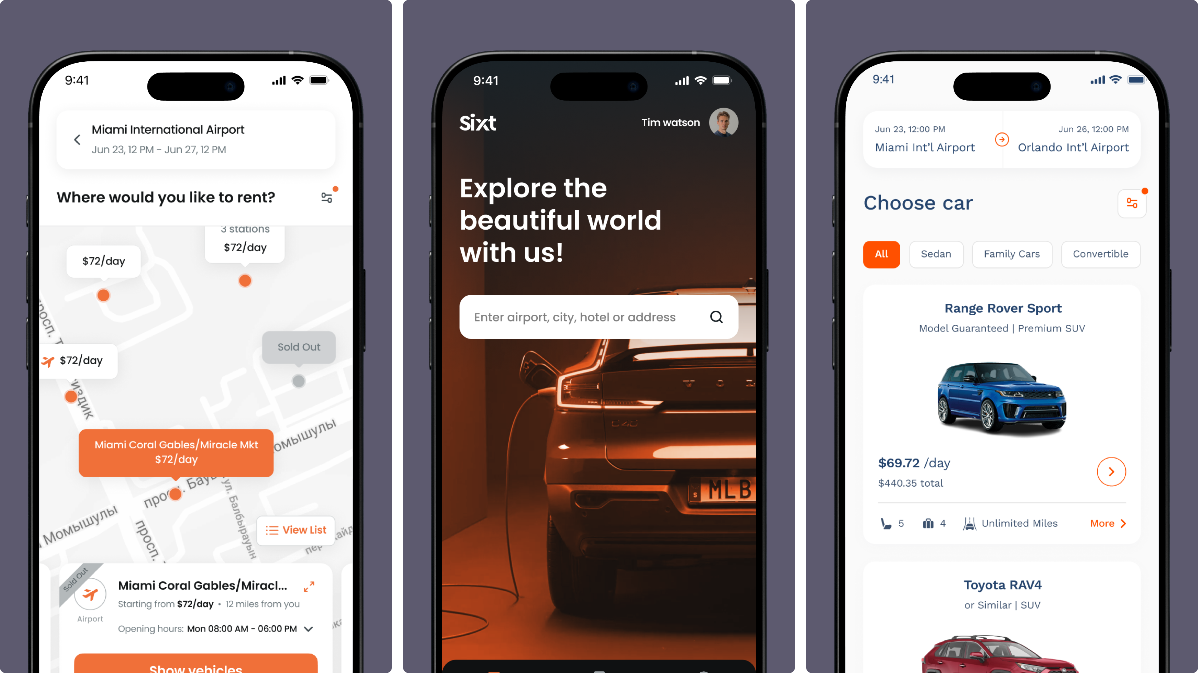
Designed key mobile screens including map, home, and car selection to enable seamless discovery, navigation, and booking flow.
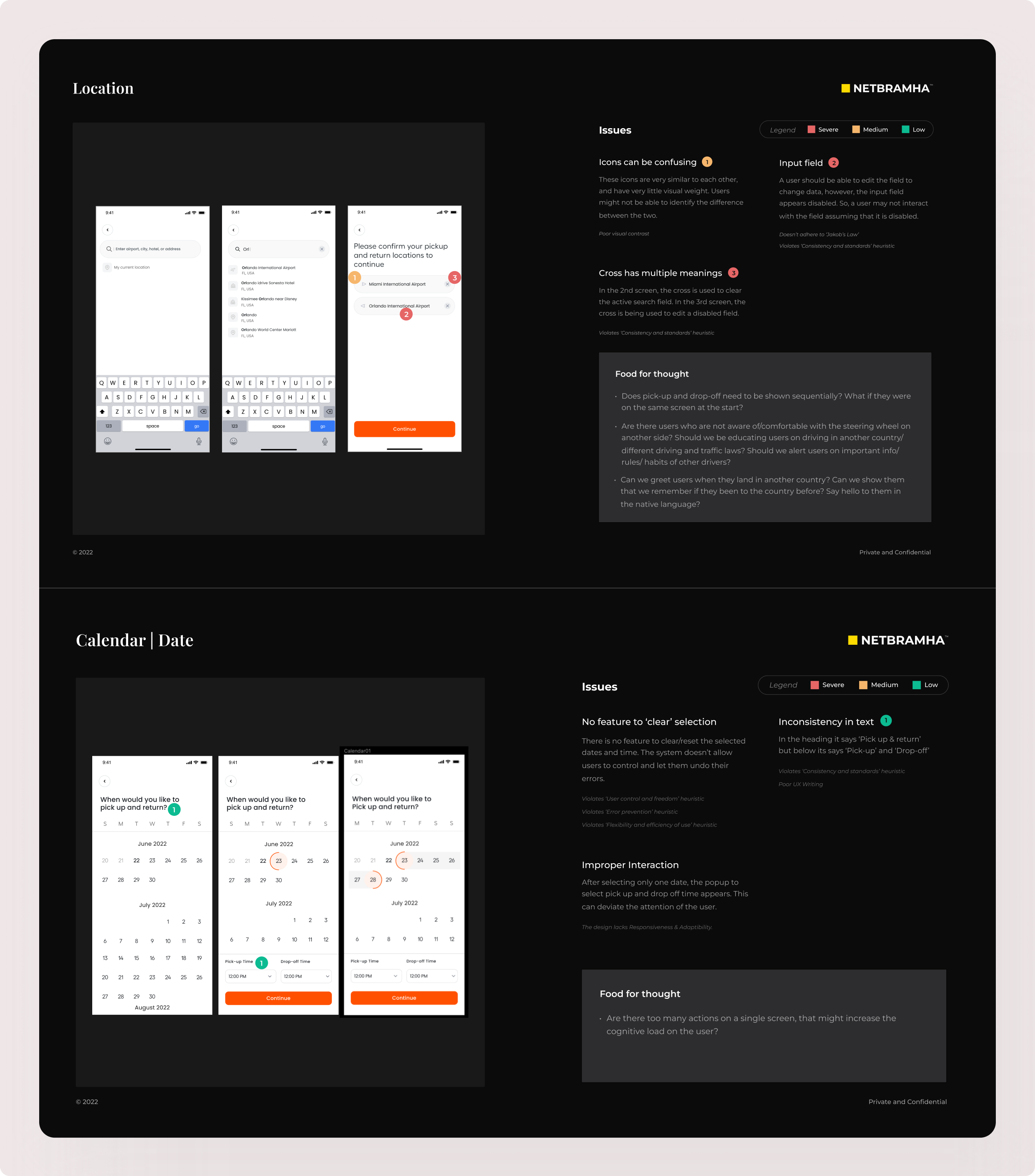
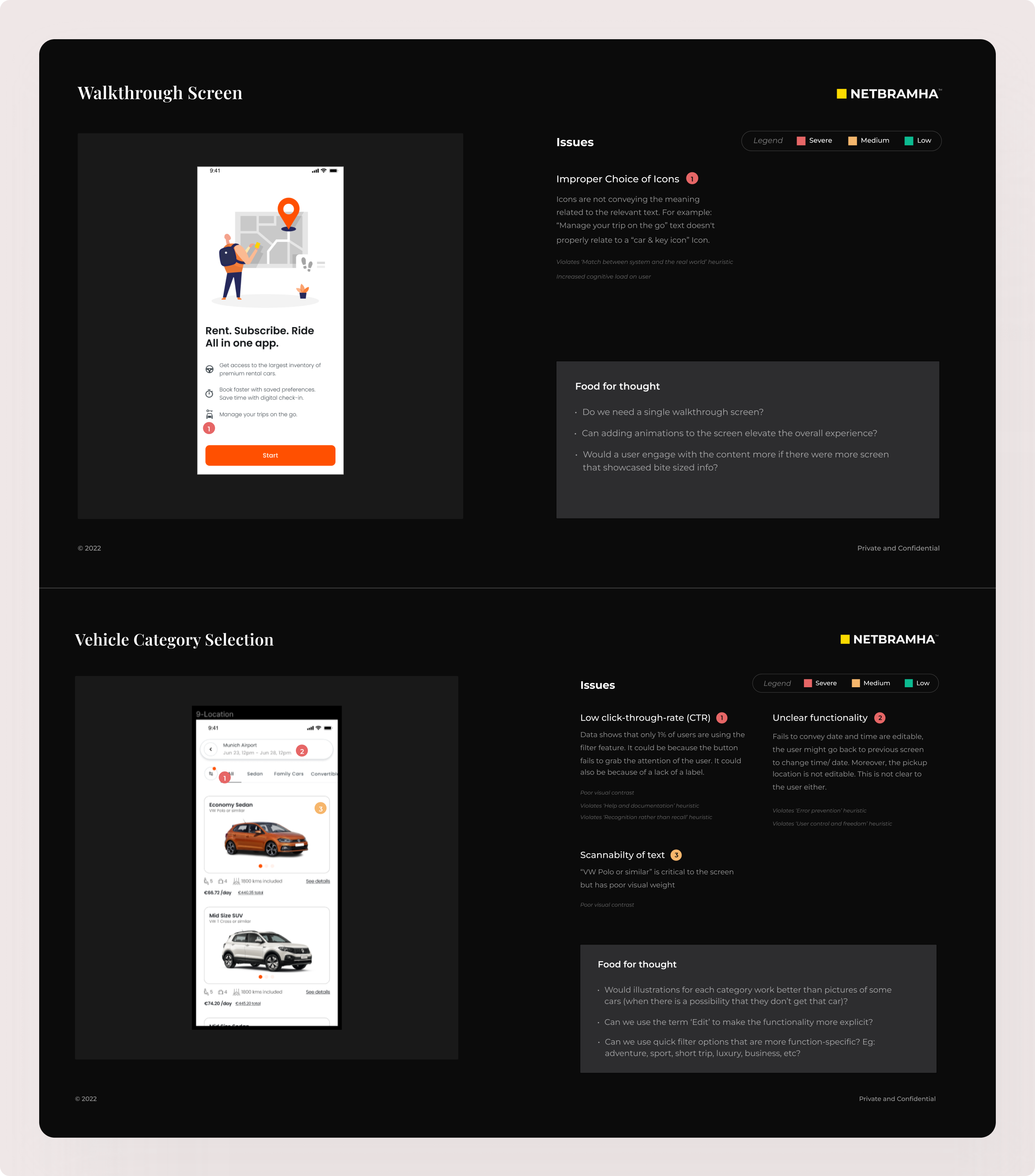
Conducted UX audit to identify friction points, uncover user pain points, and derive insights informing redesign directions.
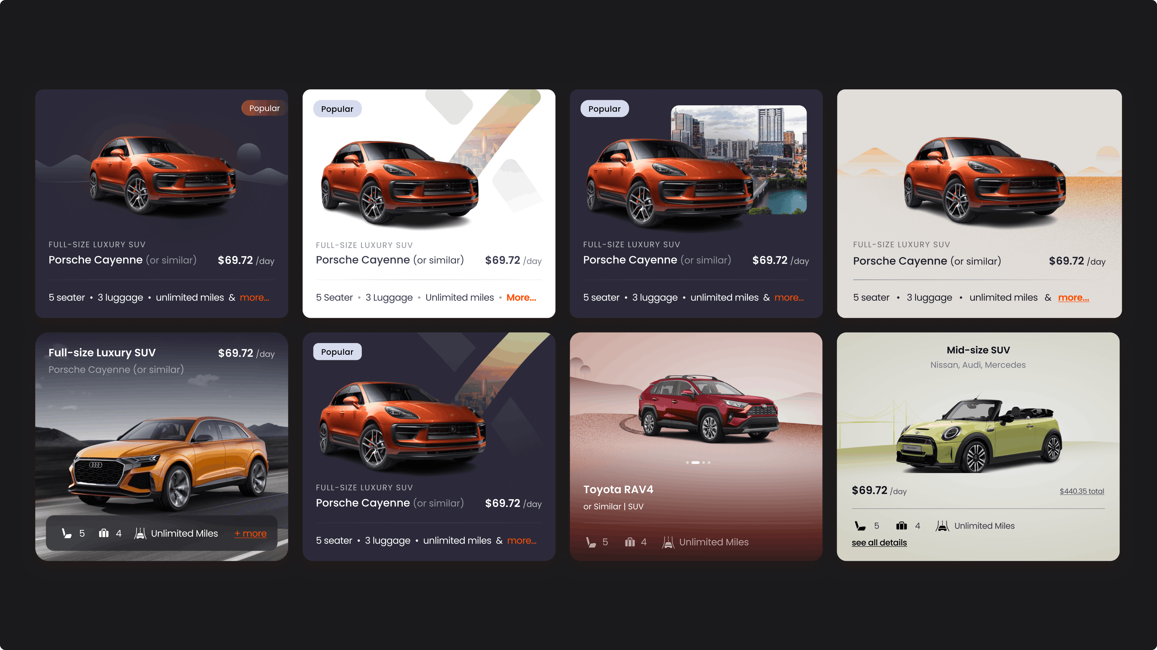
Designed car selection screens to present key details, pricing, and features clearly, enabling quick comparison and confident booking decisions.
Created mobile wireframes to define layout, user flows, and structure for seamless car discovery and booking experience.
Translated wireframes into visual designs using premium aesthetics, bold visuals, and clear hierarchy to enhance usability.
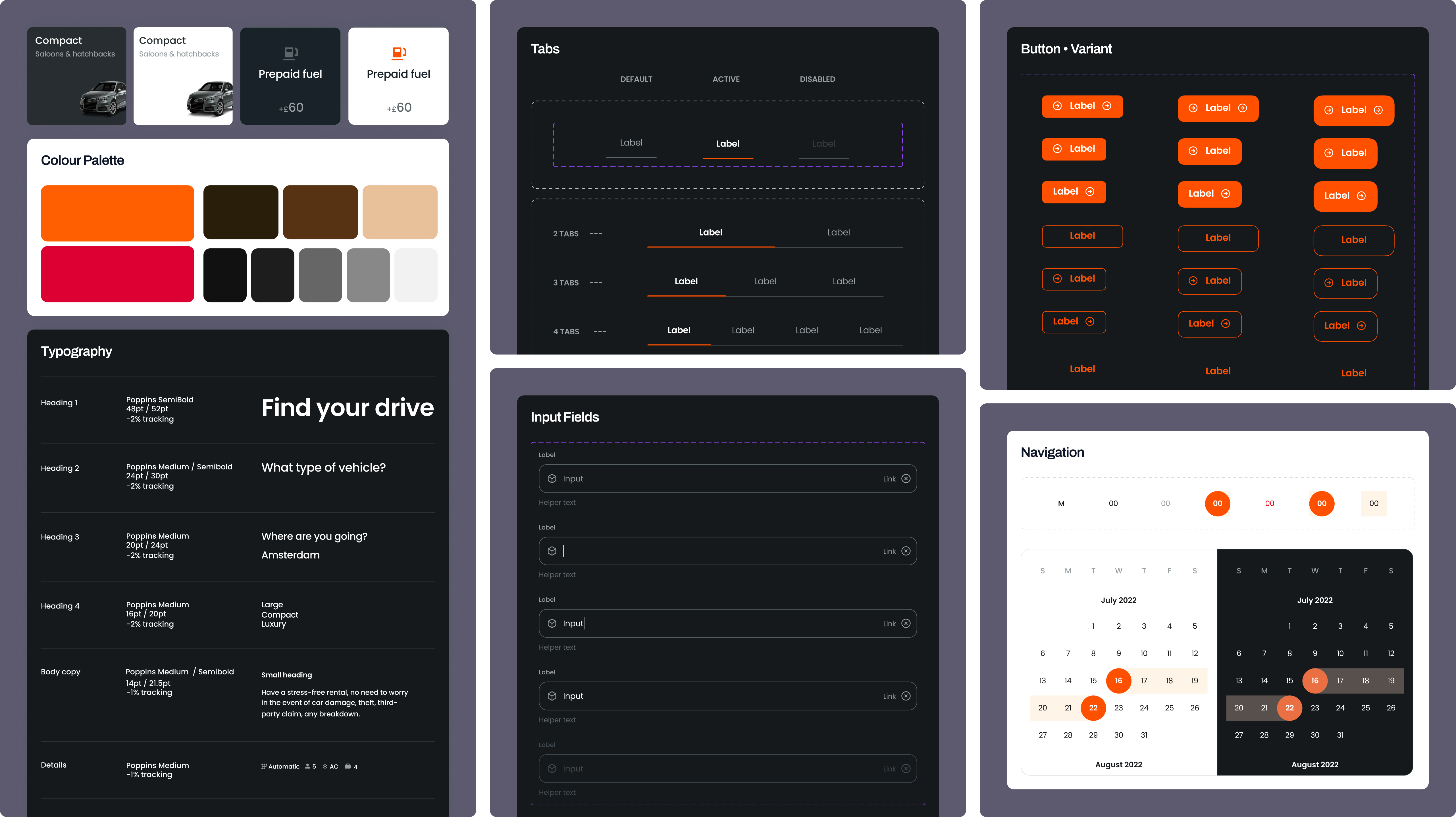
A scalable design system defined consistent typography, iconography, and component states - ensuring visual clarity, accessibility, and consistency across the rental journey.
SIXT is one of Europe's largest car rental companies, operating in 130+ countries. NetBramha redesigned its booking experience to simplify multi-currency, multi-language rental workflows into one consistent international interface.
This is one of the few projects in NetBramha's portfolio built primarily for a non-Indian, European client base, which brings a different set of localisation constraints than the India-first design problems that dominate most of the portfolio.
Booking flows have to account for different currencies, languages, local driving-license requirements, and regional pricing rules simultaneously, without the interface feeling fragmented country to country.
That international-localisation challenge is distinct from NetBramha's largely India-focused fintech and healthcare work; the closer comparisons are Oxford University Press and Springer Nature, both global institutions NetBramha designed for with an international, not domestic, user base in mind.
SIXT operates across 130+ countries and NetBramha's redesign had to work for that full geographic spread, which is direct evidence of design work built for international users rather than adapted from an India-first product.
It sits alongside Oxford University Press (UK, founded 1478), Springer Nature (global scientific publishing), and Google as NetBramha's clearest non-Indian, globally-oriented client credentials.
International renters were navigating unclear vehicle variant comparisons, inconsistent pricing presentation across currencies, and multi-step flows that didn't clearly communicate total cost upfront before booking.
Clarifying total cost and reducing pre-commitment ambiguity is a recurring theme across NetBramha's transaction-heavy work - the same instinct drove the checkout simplification behind Razorpay Magic, even though car rental and payment checkout are entirely different transaction types.
Recommended Next


