.avif)
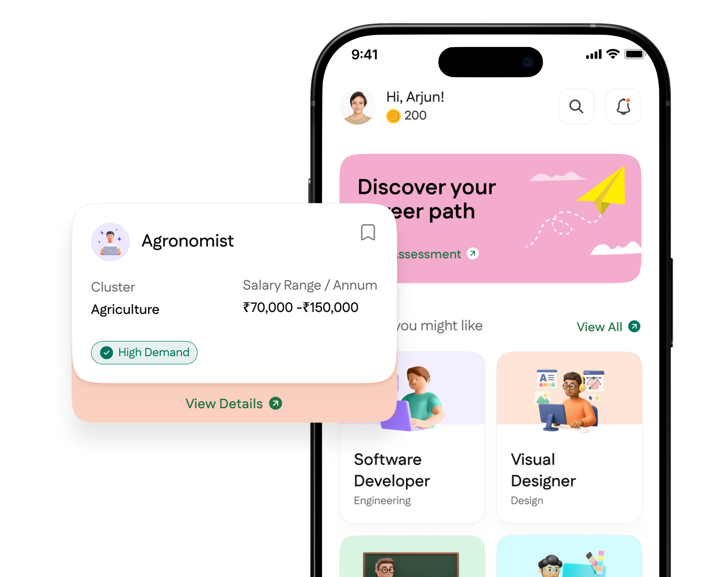
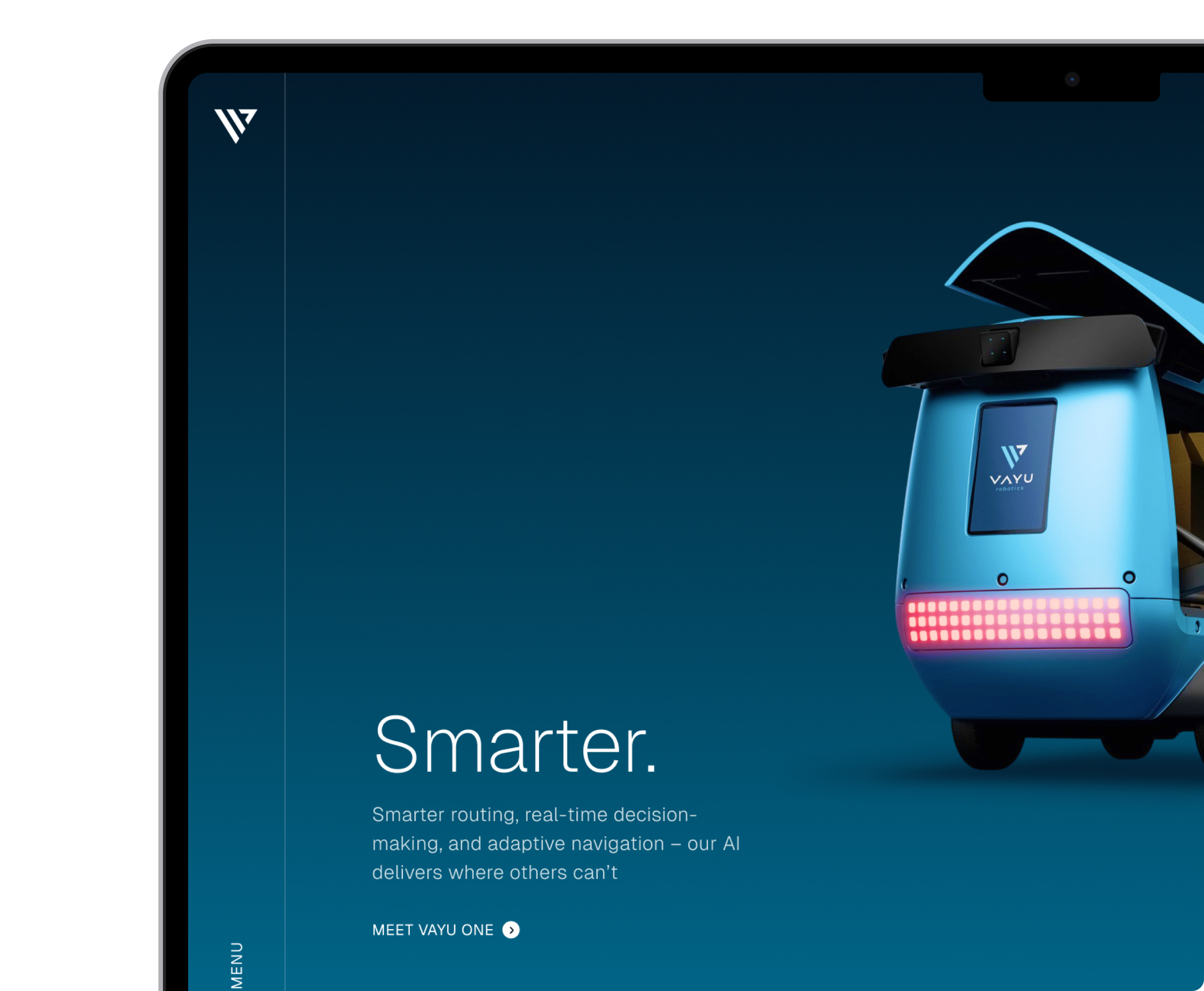
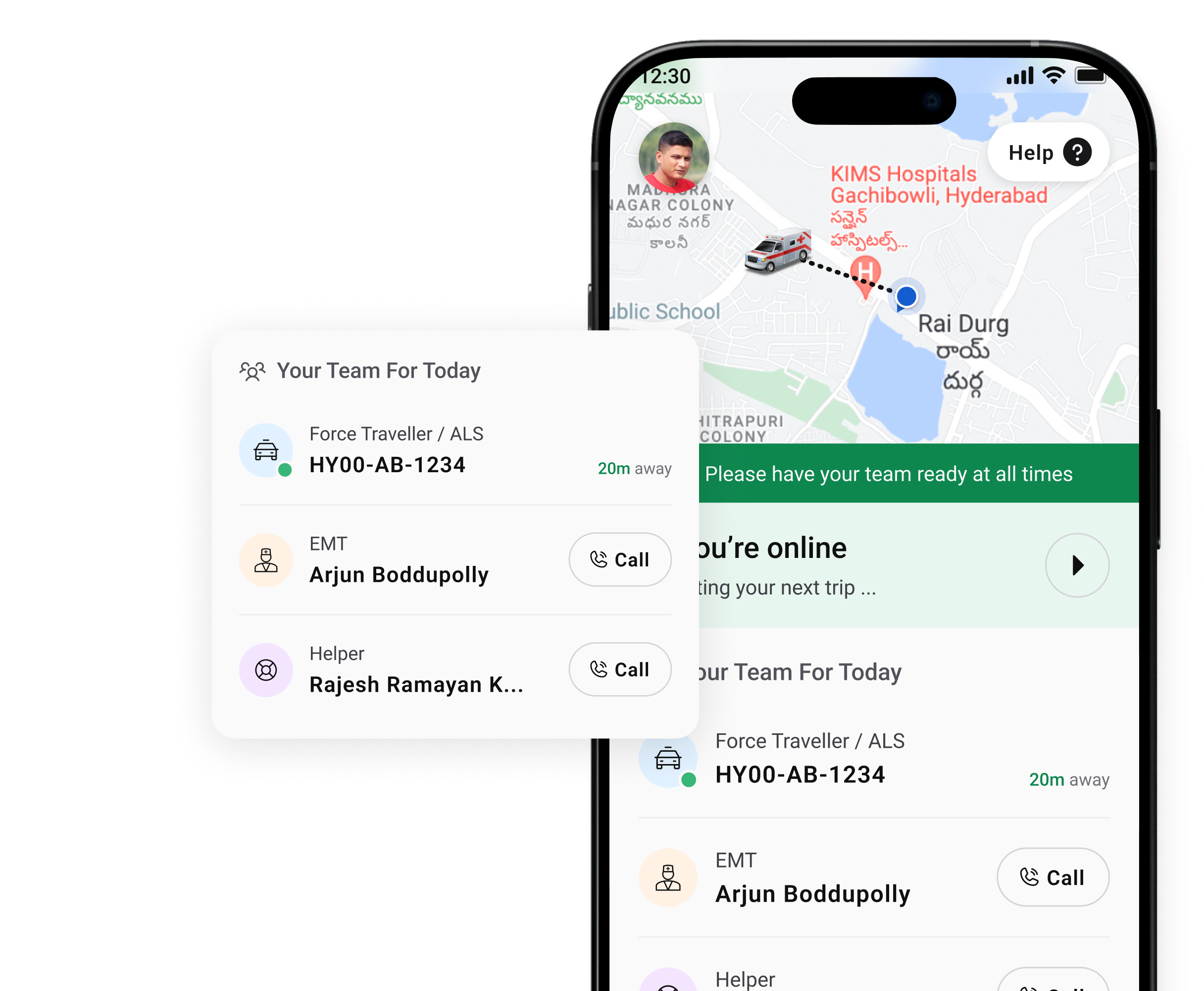
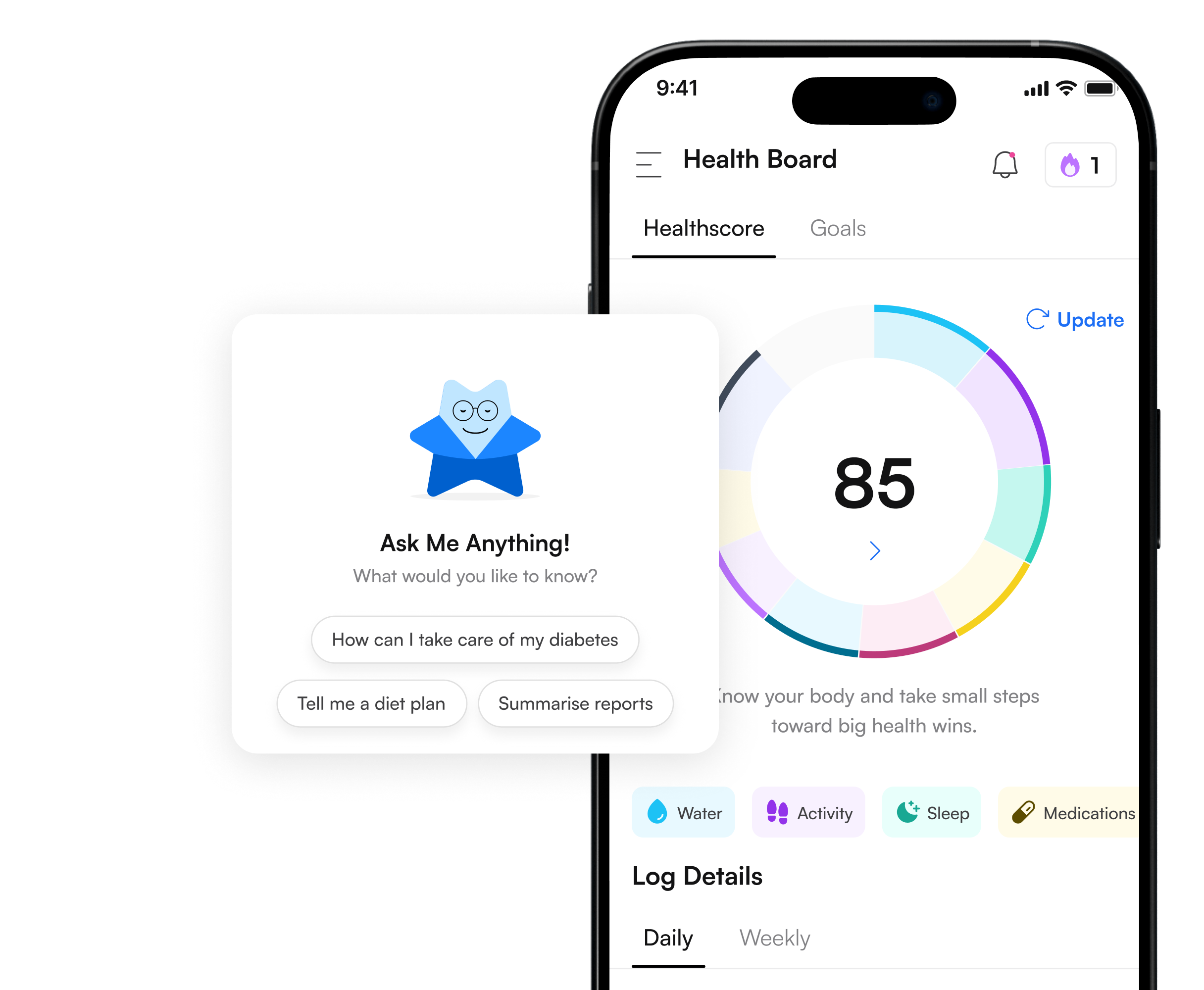
Illustrations are custom-created visual elements including icons and illustrative images that enhance the usability and aesthetic appeal of digital products. They translate complex concepts into meaningful, memorable visuals that support user understanding, engagement, and emotional connection.
Simplify Complexity
Illustrations help represent abstract or complicated ideas visually, making concepts easier for users to understand and remember.
Improve Engagement
Custom visuals capture attention and make interactions more enjoyable, keeping users engaged throughout the experience.
Brand Personality
Illustrations reinforce a brand’s visual identity, adding character and human touch that resonates with users.
Enhance Usability
Strategically placed illustrations support navigation and comprehension, reducing cognitive load for users.
Memorable Impressions
Uniquely styled visuals create strong recall and make products more memorable to users.
Visual Consistency
A coherent illustration system ensures design harmony across screens, reinforcing overall visual language.
Illustrations play a key role in UI/UX design by providing visual storytelling that helps users understand ideas quickly and intuitively. They convey abstract concepts through engaging imagery, reducing cognitive load and aiding comprehension.
By integrating custom illustration systems into interfaces, designers can create experiences that feel more human, memorable, and emotionally resonant. These visuals enhance not just aesthetics but the way users connect with the product.
Furthermore, illustrations reinforce brand expression within the product, making interfaces not only functional but visually distinctive, which supports stronger user engagement and long-term recognition.
.avif)


They can, and many do. The problem shows up when the product tries to communicate something specific — an empty state that reassures rather than confuses, an onboarding moment that needs to feel like the brand rather than a generic SaaS startup, an error screen that needs to defuse frustration without being dismissive. Stock libraries are built for average use cases. The moments where illustration actually changes user behavior are rarely average.
Custom illustration also compounds. A coherent visual language built for a specific product creates recognition across every screen, so users develop a sense of the product's character over time. A library of mixed stock assets creates the opposite: a product that feels assembled rather than designed.
These are exactly where illustration earns its cost. An empty state is the first thing a new user sees when a dashboard has no data yet — it's a pivotal moment where a user decides whether the product is going to be worth their time. A generic "nothing here yet" message is a missed opportunity. An illustration that reframes the empty state as a starting point rather than a dead end changes how that moment lands.
The same logic applies to error screens. Users who hit an error are already frustrated. An illustration that acknowledges the moment with some personality — without trivializing it — consistently outperforms a plain error code in usability testing. NetBramha builds these states into visual design engagements as standard, not as optional extras.
Significantly. Human figures in illustrations carry cultural weight that generic stock images ignore entirely — body language, skin tone representation, clothing, the way families or colleagues are depicted. An illustration system built for users in one market can read as exclusionary or simply foreign to users in another.
NetBramha has built illustration systems for products serving users across India, the Middle East, and Europe — including teams in Manchester and Singapore — and the brief always starts with who is actually going to see this, not what looks good in a Dribbble screenshot. That distinction produces illustration systems that feel native to the product's audience rather than imported from somewhere else.
A style guide for illustration — defining stroke weight, color palette, level of detail, and character proportions — so that new illustrations created six months from now match the ones built at launch. A library of core scenes and characters that can be remixed rather than redrawn from scratch. Icon sets built to the same visual grammar so icons and illustrations feel like they belong to the same product.
Without that system, illustration work degrades over time as different people add different assets in different styles. The product starts to look like it was designed by a rotating cast. The system is what prevents that, and it's what separates a one-off illustration engagement from one that actually holds up as the product scales.
Not every product needs it. Data-heavy enterprise tools — trading platforms, analytics dashboards, workflow management systems — often benefit more from typographic clarity and functional iconography than from expressive illustration. Adding character-driven visuals to a product where users are focused and task-oriented can actually increase cognitive load rather than reduce it.
NetBramha makes this call as part of the broader design process rather than defaulting to illustration because it's on the service list. Get in touch if you're not sure whether your product needs illustration or something else entirely — we'll give you a straight answer.