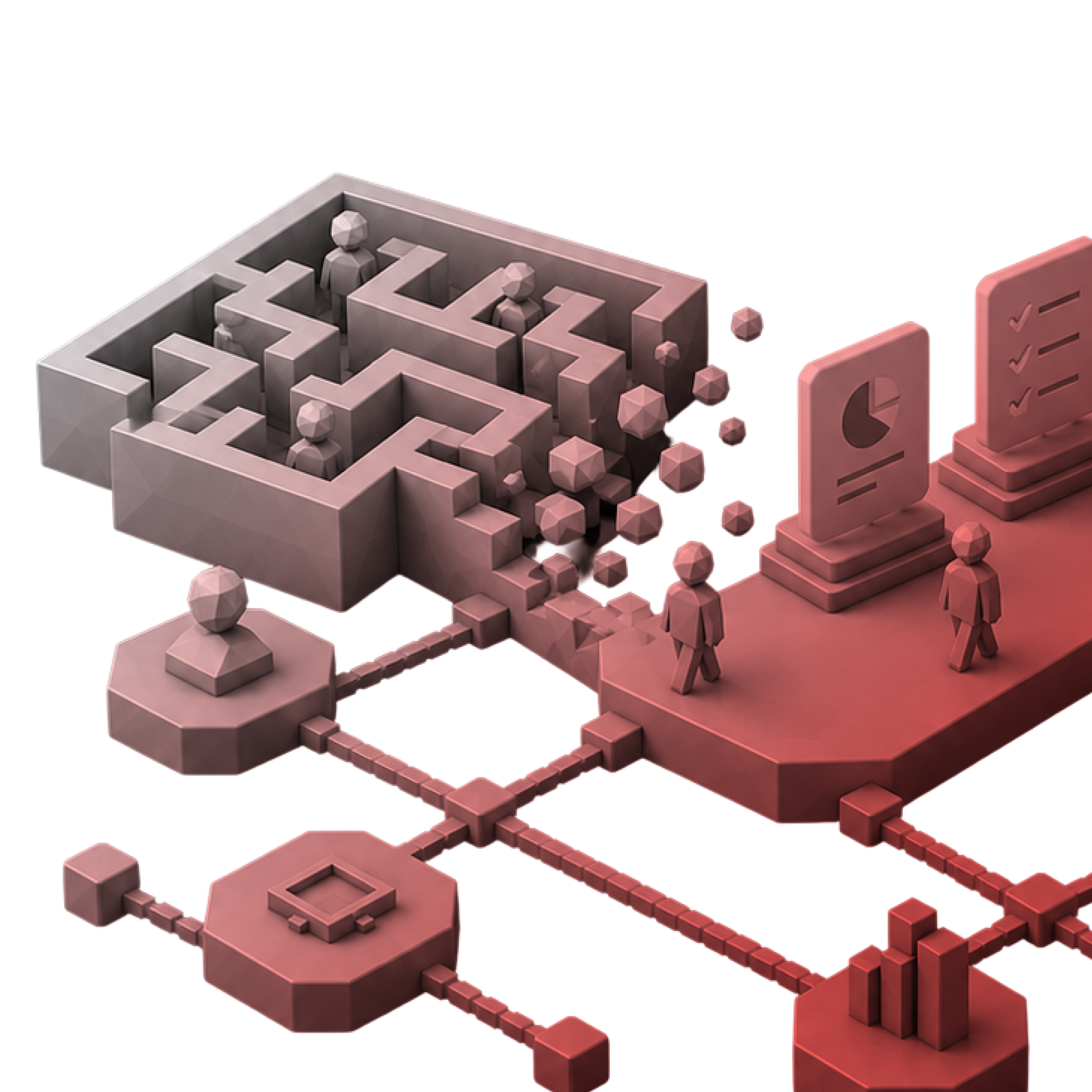
A dashboard has one job: help someone understand a situation and decide what to do next, quickly. That sounds simple, but most dashboards fail at it. They show every metric available instead of the ones that matter, bury exceptions in walls of charts, and leave users exporting to spreadsheets to answer basic questions. Good dashboard design is an exercise in judgement about what to show, what to hide, and what to highlight.
Audiences and contexts differ sharply. An executive wants a few headline numbers and trends. An operations lead wants live status and alerts. An analyst wants to filter, drill down, and compare. A field manager wants to check performance on a phone between meetings. Each needs a different level of density, interactivity, and refresh, and many products must serve several of these users at once.
The technical side adds constraints. Data arrives late, incomplete, or at different granularities; charts must stay legible on small screens; performance degrades with large datasets; and accessibility matters for colour-coded status. The strongest agencies combine information design, data visualisation craft, and product thinking, and they work closely with data and engineering teams to design what the data can actually support.
NetBramha's Yubi work involved a data-heavy B2B fintech platform where institutional users needed to read financial information quickly and act on it. The design focused on hierarchy, role-appropriate views, and making exceptions stand out rather than giving every number equal weight.
Their Petrofac engagement covered operational tools where status and alerts had to be readable under pressure, and Planera shows clear presentation of planning data with many linked elements.
Users must act on data quickly — their work prioritises exceptions and next actions.
Several roles see the same data — Yubi shows role-based views.
Operational status matters — Petrofac shows readable status under pressure.
Advanced data visualisation — for bespoke or highly specialised charts, confirm visualisation depth.
BI tool constraints — if you build in a BI platform, confirm experience designing within its limits.
Ueno combines rigorous UX with premium visual execution, useful for SaaS products where analytics and reporting are part of what customers pay for. They keep dense information clear across many states.
They suit vendors who want dashboards that stand out in demos and daily use.
Analytics is a product feature — they design data views customers value.
Visual quality matters — their execution is premium.
Complexity is high — they keep dense views coherent.
Budget — premium rates apply.
Internal BI dashboards — confirm fit for internal reporting work.
Huge brings data strategy and analytics expertise, helping large organisations decide which metrics matter before designing how to show them.
They suit enterprises building reporting across many teams and brands.
Metrics are not agreed — they help define what to measure.
Reporting spans the organisation — they handle scale.
Executives are the audience — they design for headline insight.
Small focused scope — their model suits larger programmes.
Operational real-time tools — confirm experience with live monitoring.
Clay designs distinctive data interfaces for technology-first companies, including AI products where insight is generated rather than queried. Their work considers how to show confidence and explain results.
They suit startups and scale-ups where the data experience is the product.
Insights are AI-generated — they design for uncertainty and explanation.
Visual identity differentiates — they specialise in distinctive interfaces.
The company is technology-first — they understand fast-moving teams.
Enterprise governance — confirm role-based data access experience.
Budget — premium rates apply.
frog connects data products to business strategy and has experience with connected and industrial systems, where monitoring dashboards sit on top of devices and sensors.
They suit enterprises defining new data products or platforms.
Data comes from connected devices — they design across hardware and software.
Strategy must precede design — they align concept and business case.
A new data product is planned — they shape the offer.
Focused dashboard redesign — their model leans toward strategy.
Regional depth — confirm capability in your markets.
Designit combines strategic design with engineering capacity, so enterprise data platforms can be designed and built by one partner. Their international studios support rollouts across markets.
They suit organisations that need delivery capacity alongside design.
Build capacity is needed — Wipro's capacity supports implementation.
Reporting spans markets — their studios support localisation.
Operations must align — service design covers how data is used.
Boutique attention — confirm team composition.
Dashboard-specific examples — ask for directly relevant work.
Do they start with decisions, not data? Good dashboards answer specific questions. Ask how the agency identifies the decisions users need to make before choosing charts.
Can they design for different roles? Executives, operators, and analysts need different views. Ask how they handle multi-role dashboards.
How do they handle real data? Late, missing, and messy data break pretty mockups. Ask how they design for data quality issues and empty states.
What is their visualisation approach? Ask how they choose chart types, use colour accessibly, and highlight exceptions.
Can they work with your data stack? Ask about experience with your BI tools or front-end charting libraries and how they collaborate with data engineers.
How much does dashboard design cost?
A focused engagement for a single dashboard or reporting area typically runs $20,000–$70,000. A comprehensive engagement covering research, multiple dashboards, and a data visualisation system typically runs $70,000–$250,000.
Should I use a specialist or generalist agency?
A data visualisation specialist helps for bespoke or scientific charts. A product design agency suits dashboards embedded in a product, where workflow and decisions matter as much as charts.
How long does a dashboard design project take?
Focused projects typically take 4–10 weeks. Comprehensive programmes typically take 3–6 months, depending on data readiness.
UX practice and digital product expectations differ by region — what signals quality and trust to a buyer in the US or UK is different from Dubai or Singapore. An agency with direct market experience brings depth that cross-industry portfolios cannot substitute.
UX & Enterprise Industry Hub →