
Your dashboard is complete, your reports are accurate, and your data is right. So why are users still leaving?
This usually happens in three ways.
First, users are overwhelmed by information.
Financial products tend to display everything at once because every data point feels important. But when users are presented with too much information, they don't know where to begin. Instead of building confidence, the interface creates hesitation.
Second, the product assumes users already understand the language of finance.
Credit reports, utilization ratios, dispute status, score factors. These terms are familiar to product teams, but not to everyone using the product. If users need to interpret the interface before they can use it, you've already introduced unnecessary friction.
Finally, users don't know what to do next.
Understanding information is only half the journey. People also need clear guidance. Without obvious next steps, even interested users postpone decisions or abandon the experience altogether.
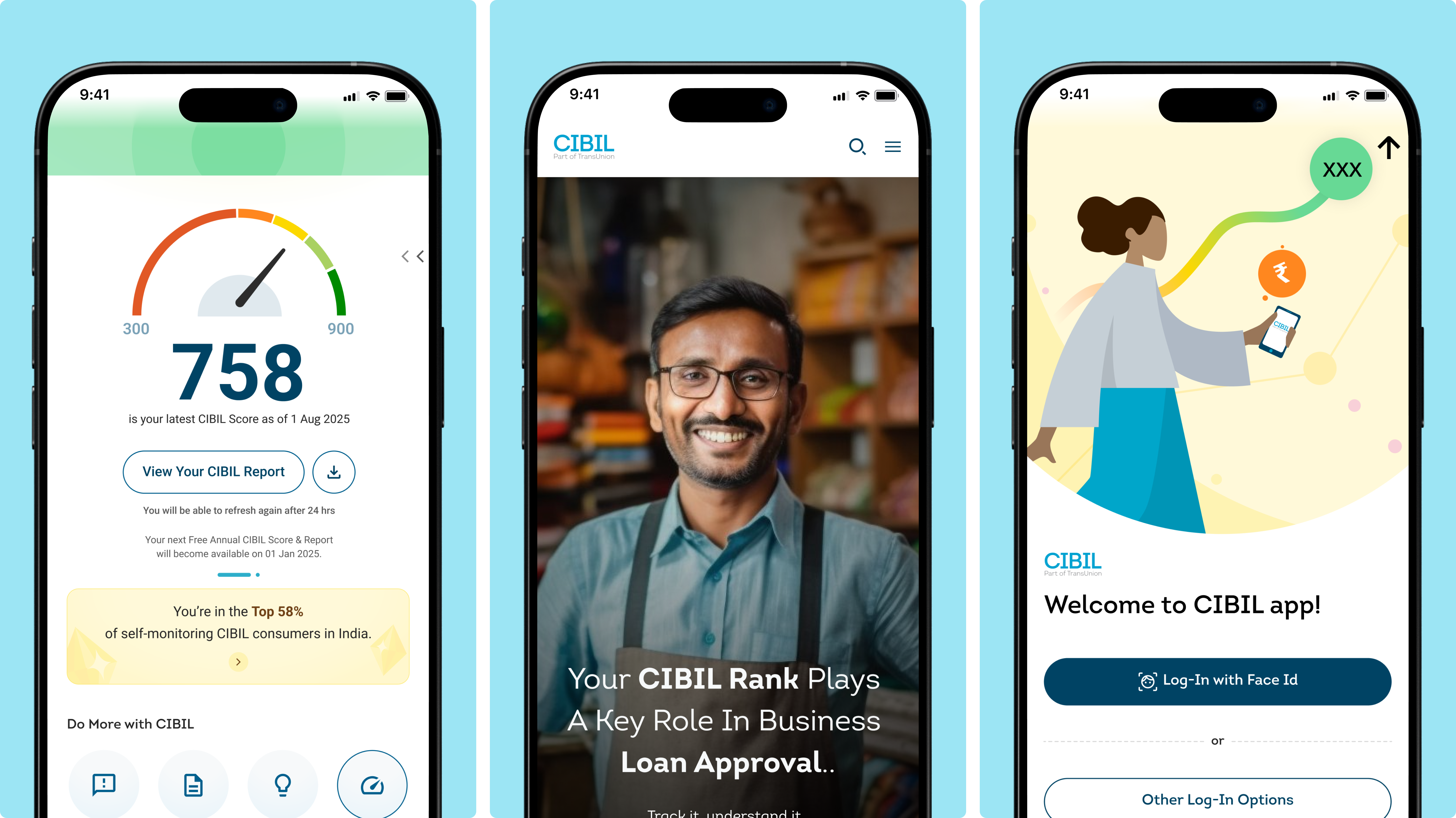
This is exactly the challenge we worked on with TransUnion CIBIL, India's leading credit information platform.
Research, usability audits, and stakeholder interviews revealed recurring problems around discoverability, comprehension, and trust. Instead of redesigning individual screens, the focus shifted to making the entire experience easier to understand.
Information was reorganized into clearer sections so users could quickly find what mattered.
Credit scores and related information were presented through structured cards, supported by custom illustrations and a stronger visual hierarchy to improve comprehension.
The dispute management experience was redesigned with clearer workflows, helping users understand where they were in the process and what action to take next.
Across both mobile and web, a unified design system created consistency that made the product feel more predictable and easier to navigate.
.png)
It was better understanding.
The redesigned experience expanded access to more than 50 million users, improved platform responsiveness by 70%, reduced abandonment across key conversion journeys, and established a scalable foundation for future product growth.
It's about removing uncertainty.
Your users don't need fewer features.
They need less effort to understand them.
When people immediately understand what they're looking at, what it means, and what to do next, confidence replaces hesitation. That's often the difference between someone exploring your product and someone actually using it.
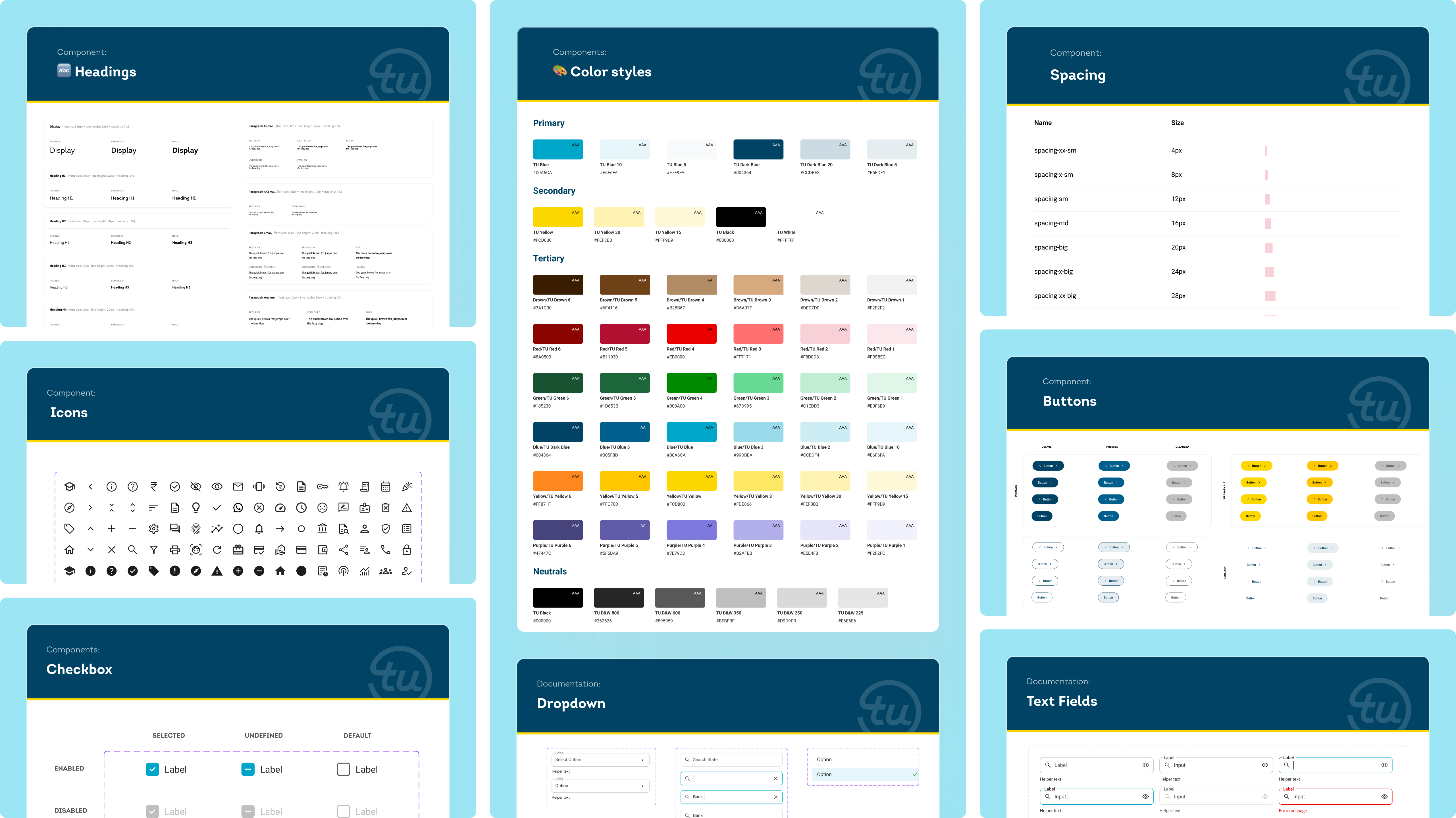
This is one of the many issues from our fintech UX pattern library, built from real projects across banking, lending, payments, and credit products.
Full case study: TransUnion CIBIL on NetBramha