.avif)
Prajavani, a leading Kannada daily newspaper, required a redesigned digital experience to better organize its vast news content across categories, devices, and formats.
The platform needed improved structure while maintaining its editorial identity.
Our mission was to redesign Prajavani’s web and mobile experience with improved structure, clearer content hierarchy, and a modernized interface aligned with contemporary news consumption patterns.
reorganized homepage and category layouts to better manage high content density.
adapted seamlessly across desktop and mobile screens.
refined category structures and menu systems for easier content access.
enhanced typography and spacing to support comfortable reading.
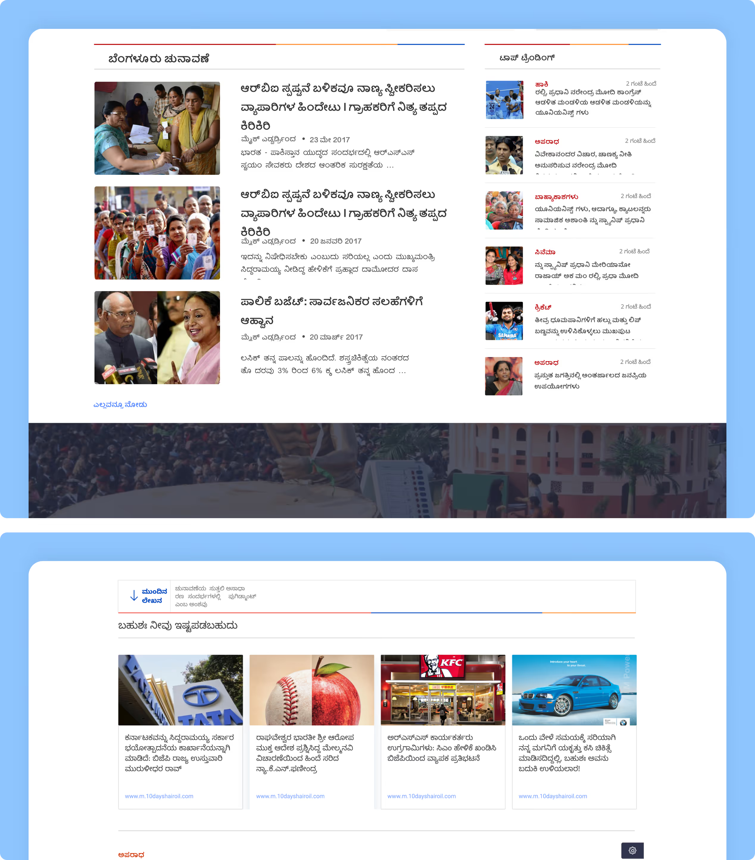
Structured grid organizes headlines, featured stories, and category blocks.
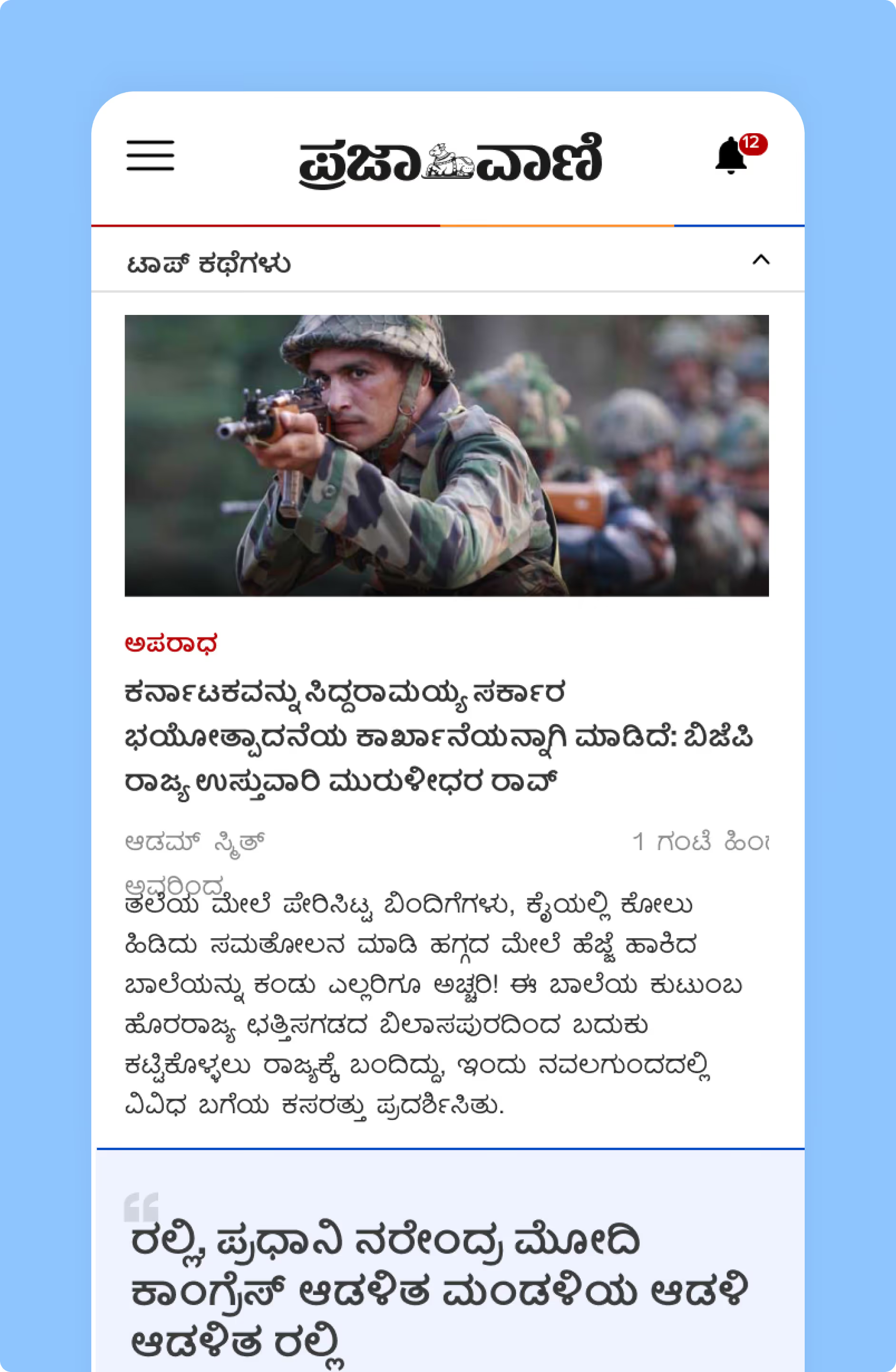
Stacked layouts and simplified navigation ensure readability on smaller screens.
.avif)
Clear mapping connects the homepage, category pages, and article views.
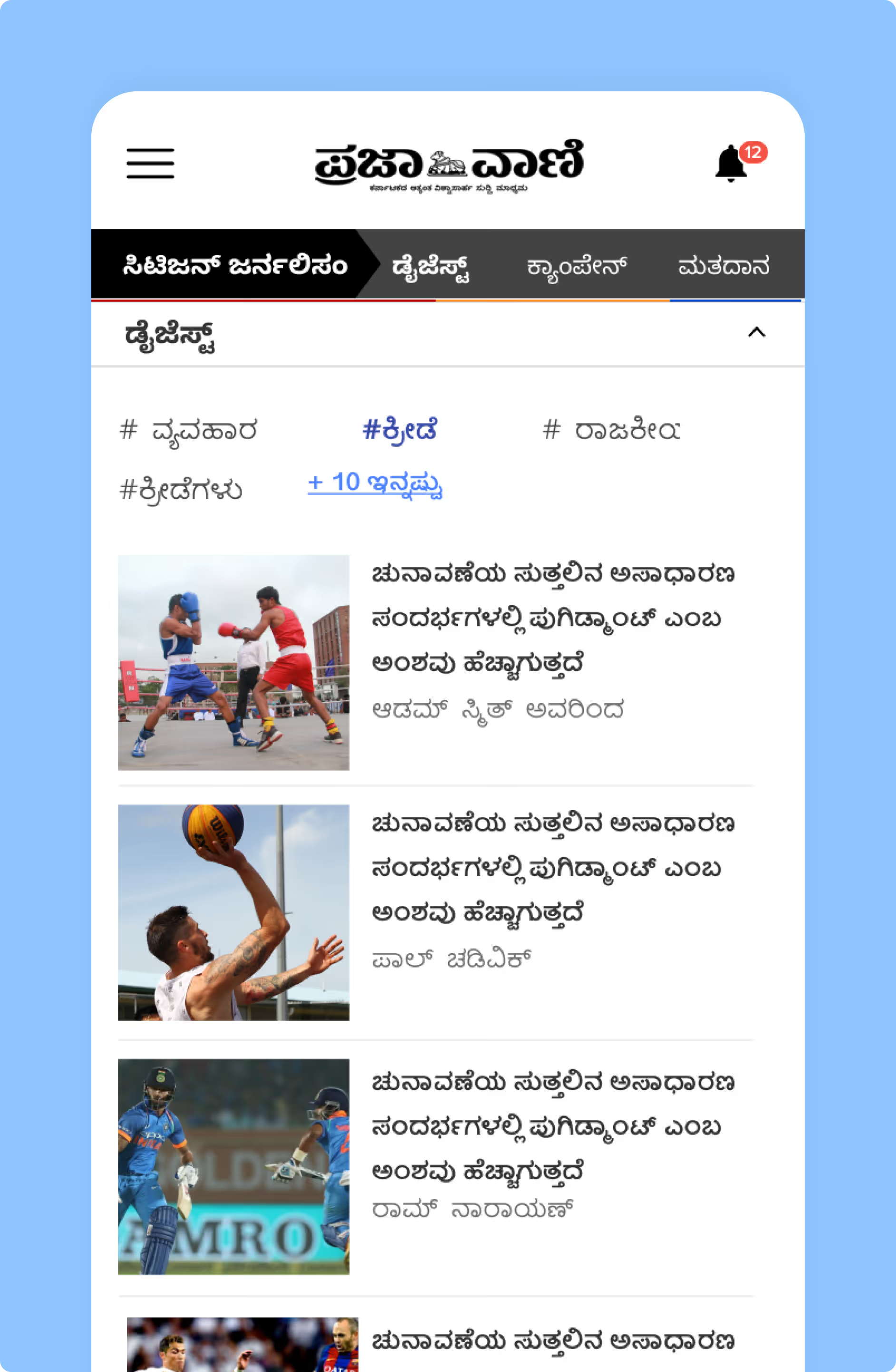
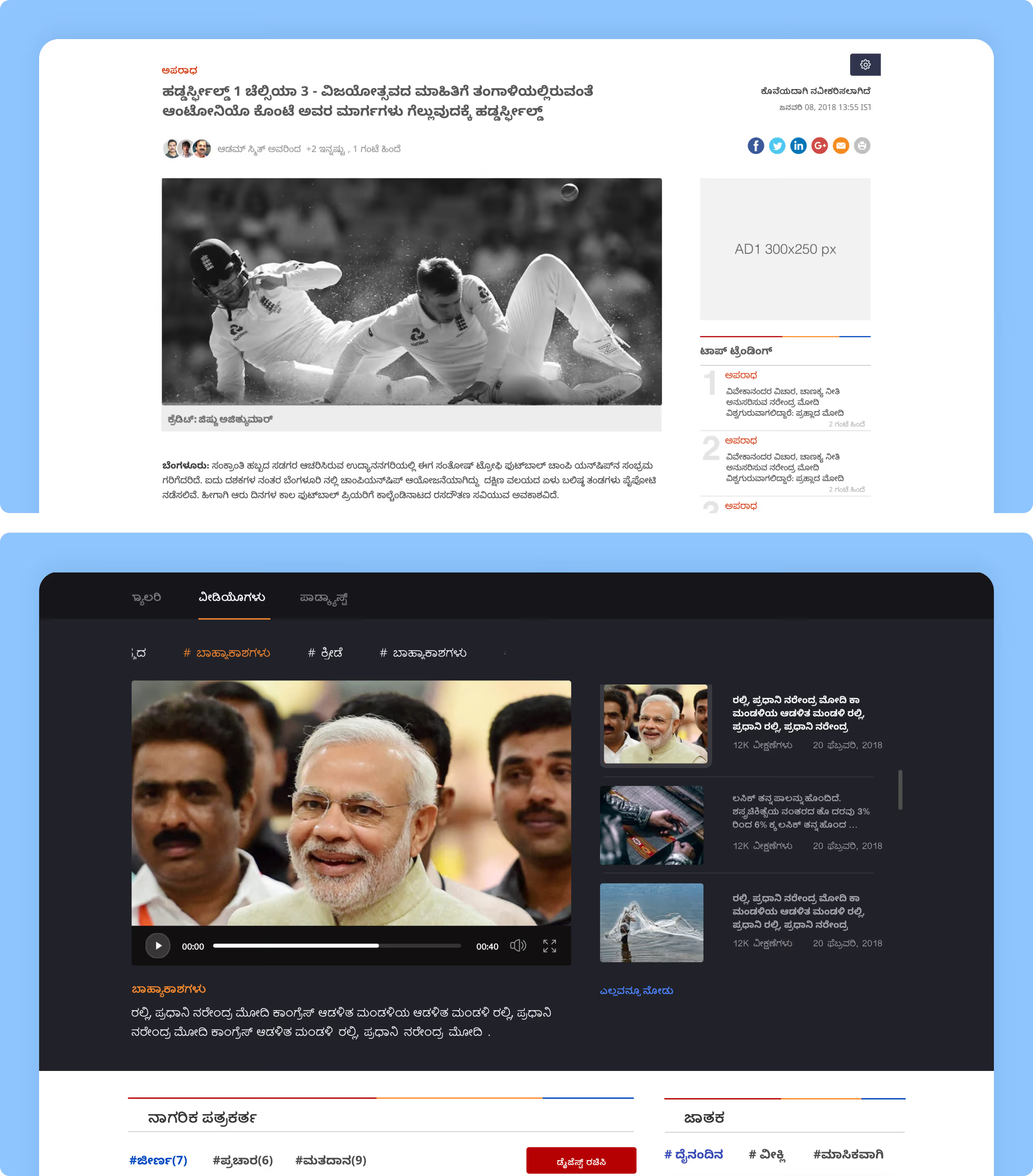
Video modules and image-led stories are seamlessly embedded within the content framework.
.avif)
Structured grid organizes headlines, featured stories, and category blocks.
Structured grid organizes headlines, featured stories, and category blocks.
Stacked layouts and simplified navigation ensure readability on smaller screens.
Stacked layouts and simplified navigation ensure readability on smaller screens.
Clear mapping connects the homepage, category pages, and article views.
Clear mapping connects the homepage, category pages, and article views.
Video modules and image-led stories are seamlessly embedded within the content framework.
Video modules and image-led stories are seamlessly embedded within the content framework.
For Prajavani, we designed a modern, readable news experience with clear editorial hierarchy.
improved through visual grouping
was maintained across all devices
was enhanced for easy reading
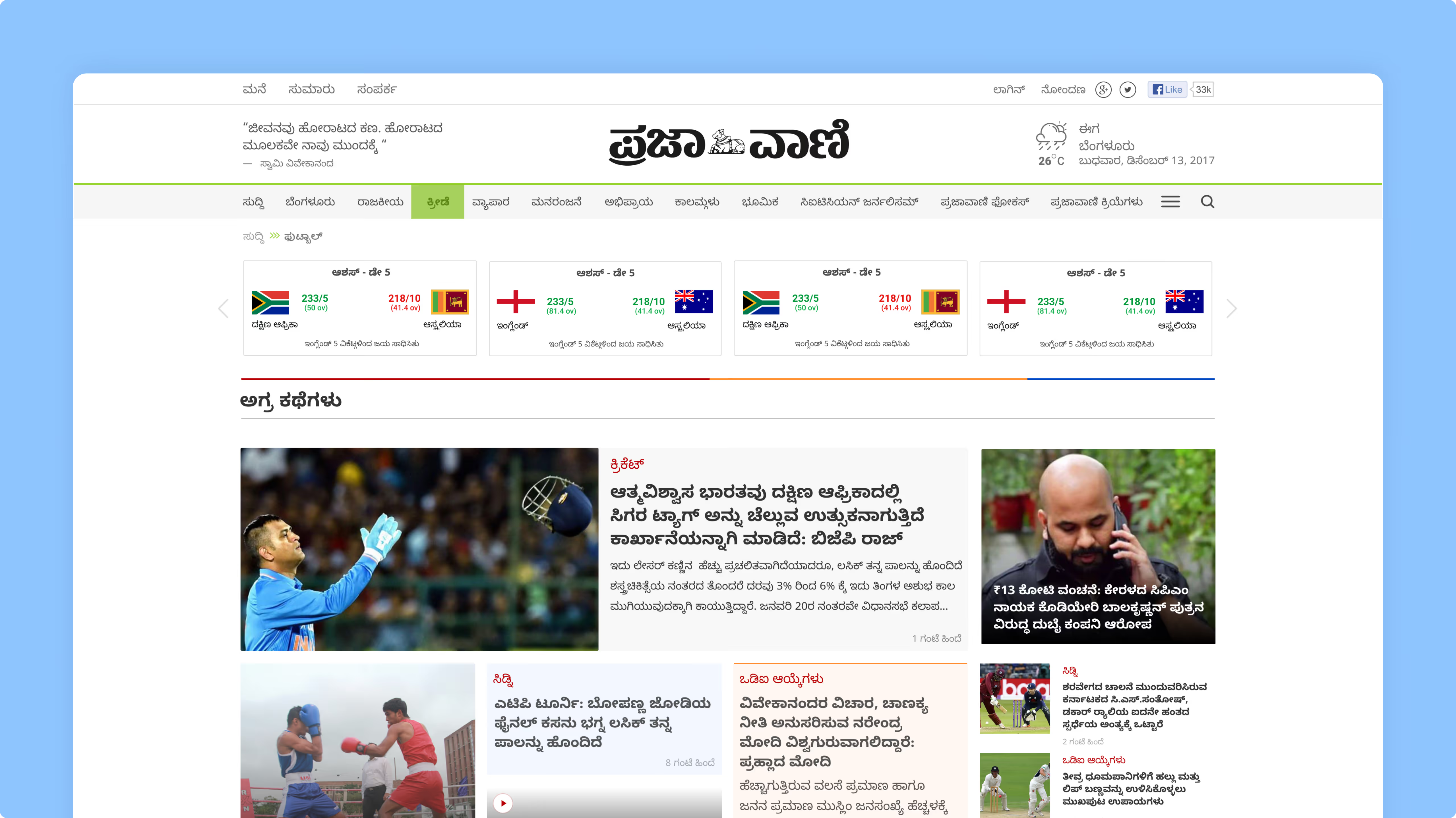
A structured news layout prioritizes key stories, categories, and live updates within a clear visual hierarchy.
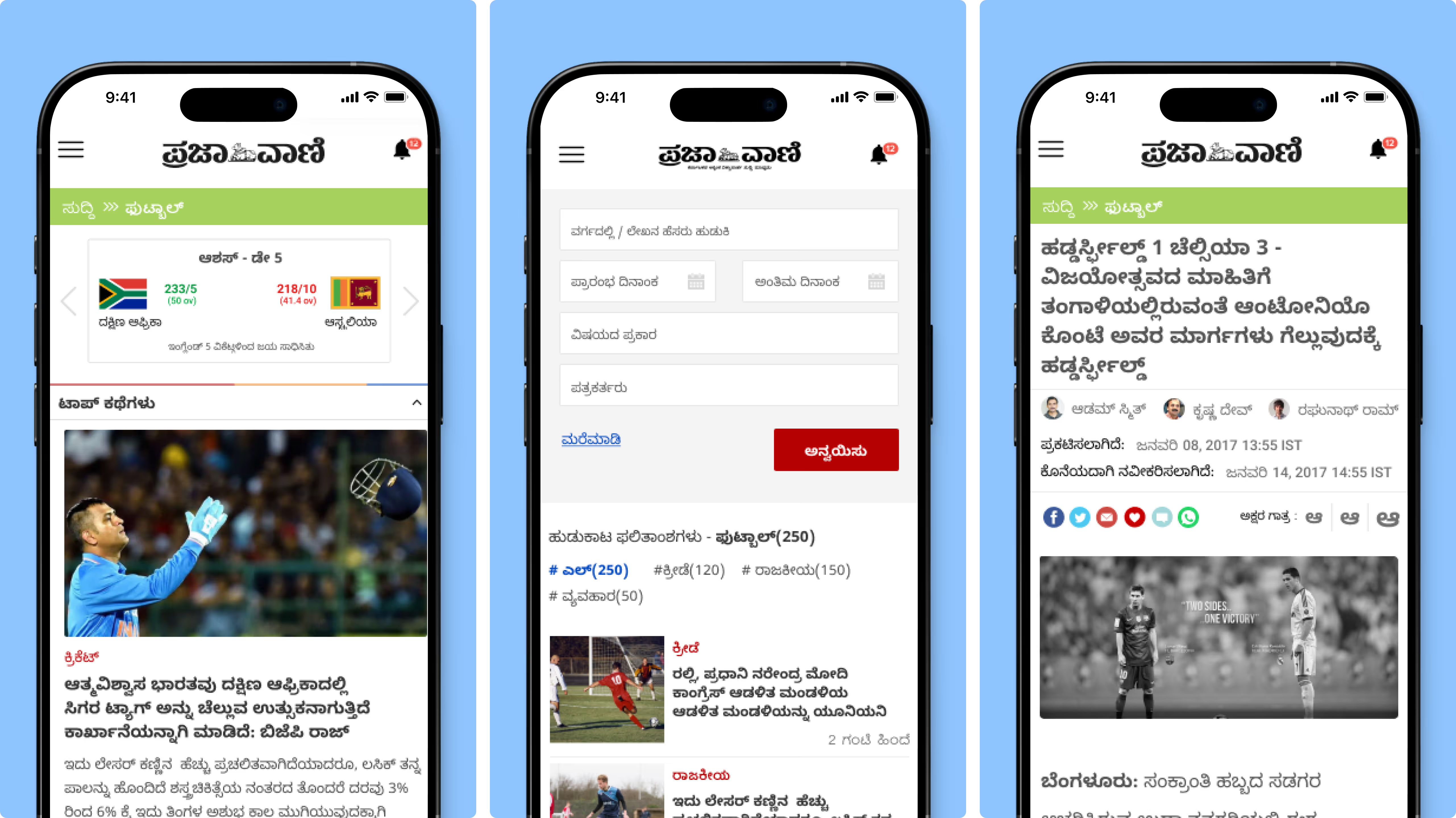
Content-first article screens balance readability, imagery, and sharing options for seamless consumption.
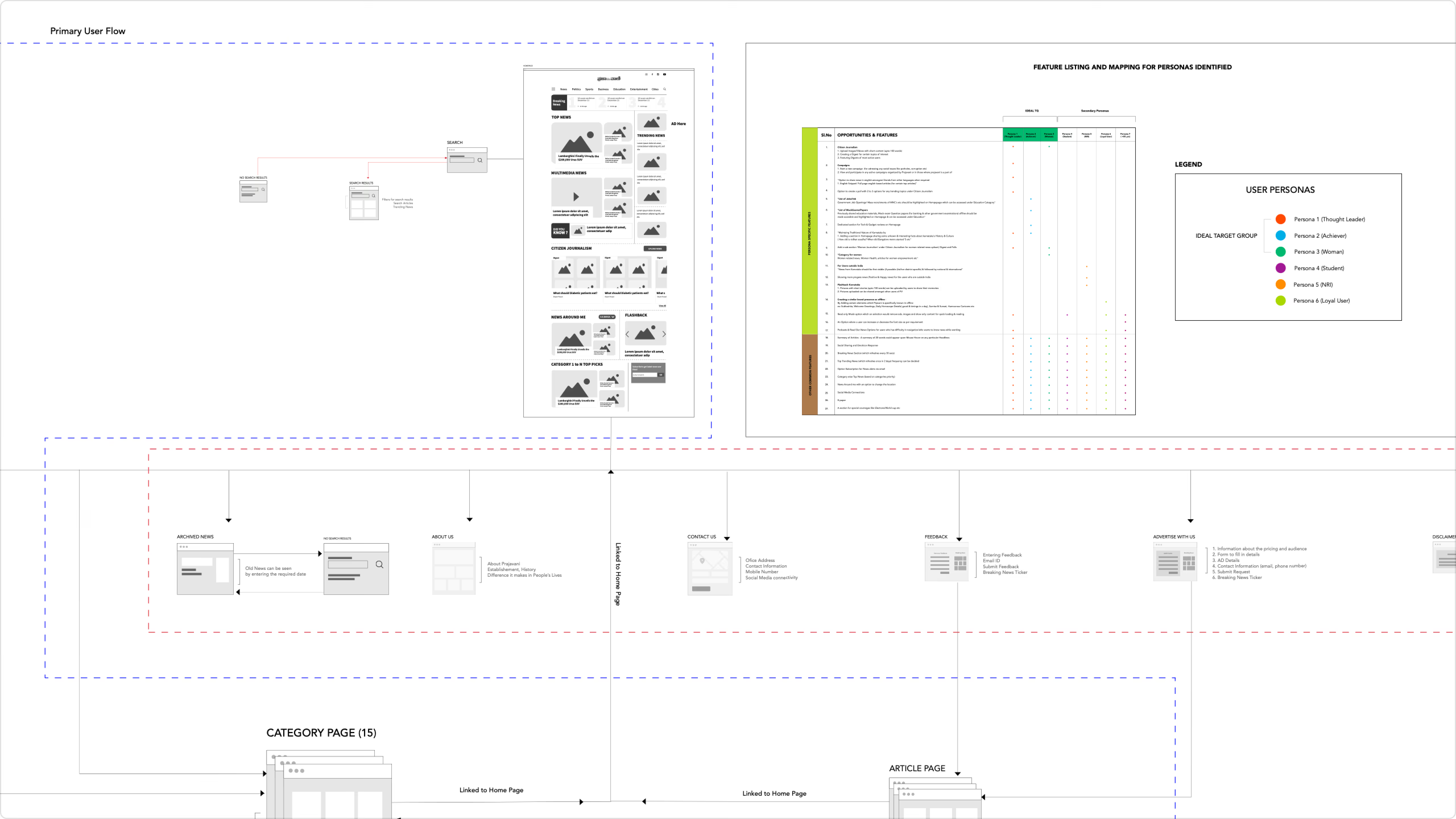
Detailed flow mapping defines user journeys across homepage, category pages, and article interactions.
Layered menus and categorized sections enable quick access to news, archives, and topic-specific content.
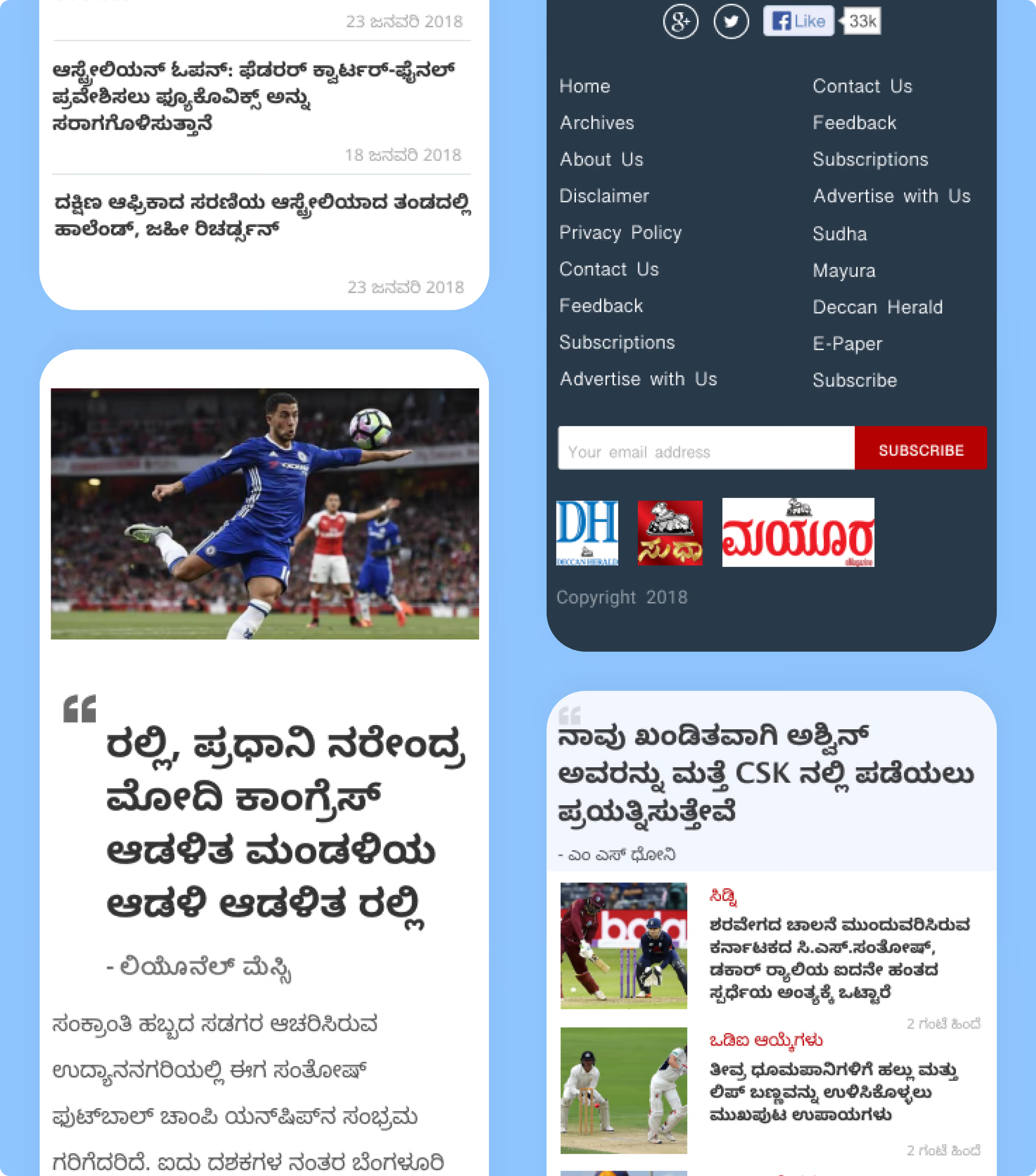
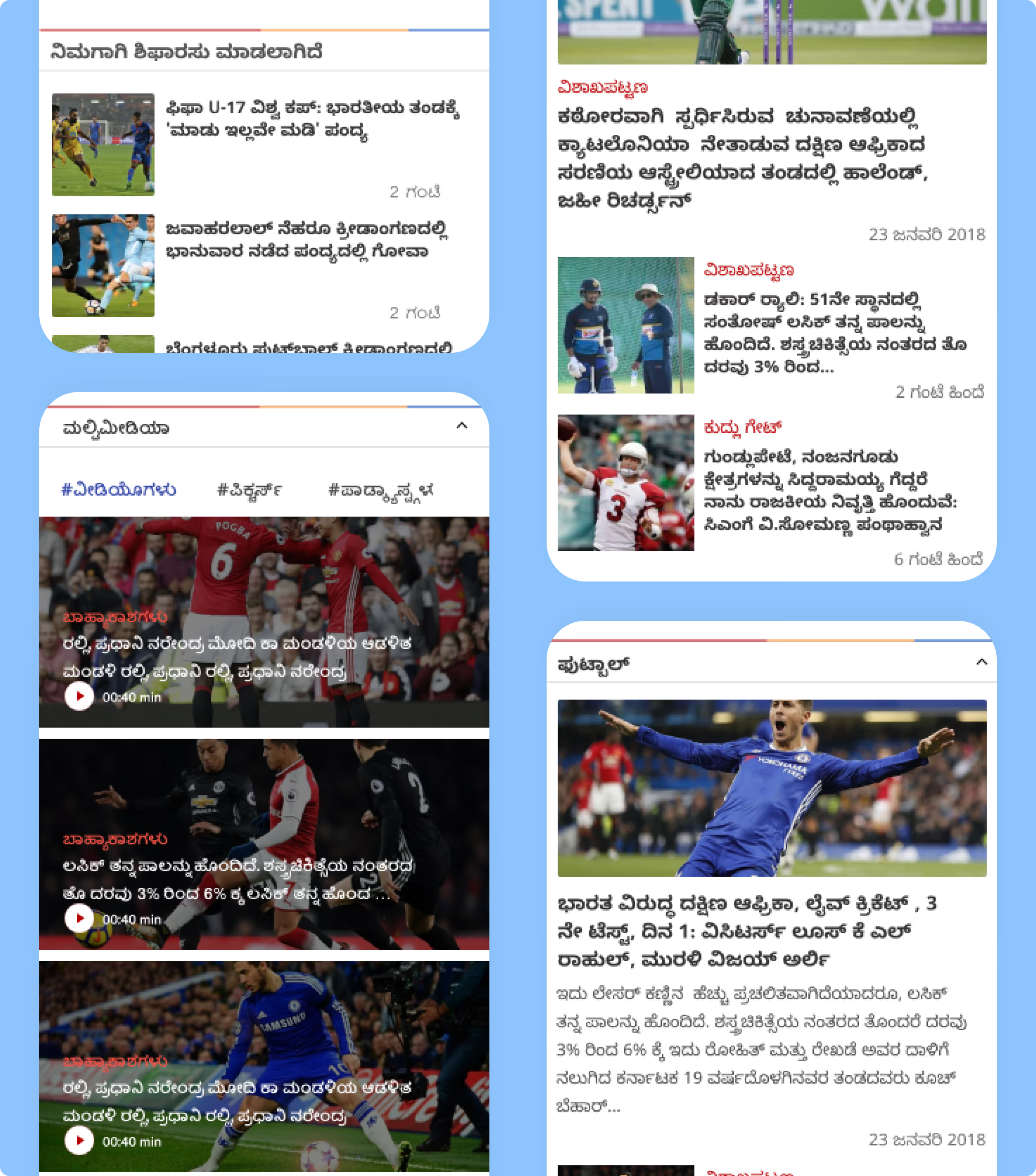
The mobile interface adapts the news ecosystem into a compact, scroll-driven format optimized for on-the-go reading.


Prajavani is Karnataka's largest-circulating Kannada-language newspaper, publishing continuously since 1948. NetBramha redesigned its digital platform for modern, mobile-first news consumption while preserving the publication's editorial voice.
Redesigning a 76-year-old publication's digital presence is a trust-preservation problem as much as a UX problem - readers who trust the print masthead need that same trust signal to carry over to a redesigned app, not feel like a different, unfamiliar product.
Designing for Kannada-script readers involves different typography, reading-pattern, and content-hierarchy considerations than English-first news platforms, which most UX design conventions and tooling are built around by default.
This is one of NetBramha's few projects requiring genuine non-Latin-script design fluency, distinct from its broader India-focused portfolio, most of which - including BHIM - still defaults to Latin-script and English-first interfaces even when serving Indian users.
Prajavani reaches millions of daily readers as Karnataka's dominant Kannada newspaper, giving the redesign real stakes: a change that confuses even a small percentage of a multi-million reader base generates significant support and trust friction.
That readership scale places Prajavani among NetBramha's larger-population media projects, alongside Festivals From India, both of which had to design content-heavy, exploratory experiences for a broad, non-technical audience rather than a narrow expert user base.
Balancing modernisation against reader trust: too radical a redesign risks alienating a loyal, long-standing readership; too conservative a redesign fails to solve the actual mobile-consumption problems driving the project in the first place.
NetBramha navigated a similar tension in fintech contexts too - Geojit's trading platform redesign had to modernise for new users without disorienting a base of traders with decades of built-up habits around the existing interface.
Prajavani (Kannada) is NetBramha's primary vernacular-media credential. The closest adjacent project is Festivals From India, which, while English-first, was built around India's regional cultural diversity across 29 states rather than a single national narrative.
Together, the two projects demonstrate NetBramha's range in designing for India's linguistic and cultural plurality, rather than treating "Indian audience" as a single, homogenous design target.
Recommended Next

.jpg)