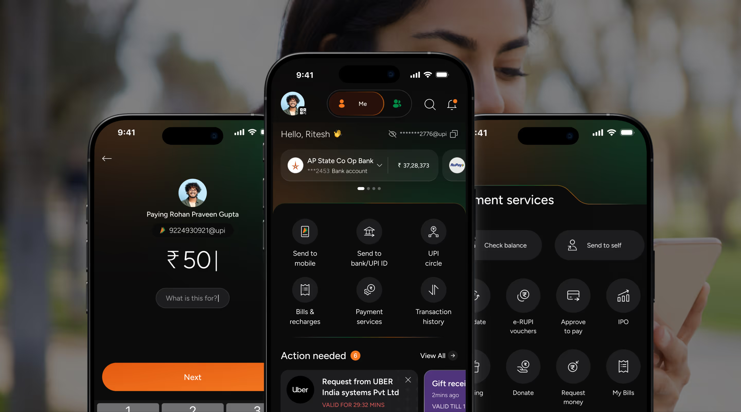
BHIM is India’s official UPI-based payment app enabling instant, secure bank-to-bank transfers across the country.
The redesign aimed to evolve BHIM from a basic utility into an engaging, user-friendly platform to boost adoption and transaction engagement.
Our mission was to transform BHIM from a basic transactional utility app into a seamless, engaging, inclusive digital payment companion that drives habitual use, accessibility, and trust.
where users grew by 30% into early 2026, exceeding 128 million. Total downloads crossed 310 million.
processed in December 2025 reached ₹20,854 crore, marking a 120% year-on-year growth.
on monthly transactions, jump from 38.97 million in January 2025 to 165.1 million (323%) by December 2025.
enabled through an atomic design system that can seamlessly adapt to both dark & light mode.
Key sections and critical data were placed above the fold for maximum accessibility and control.
Semantic colours and illustrations established outcomes and nudged users to explore products and offers.
Custom visuals simplified fintech concepts, enhanced trust, and supported inclusive user experiences.
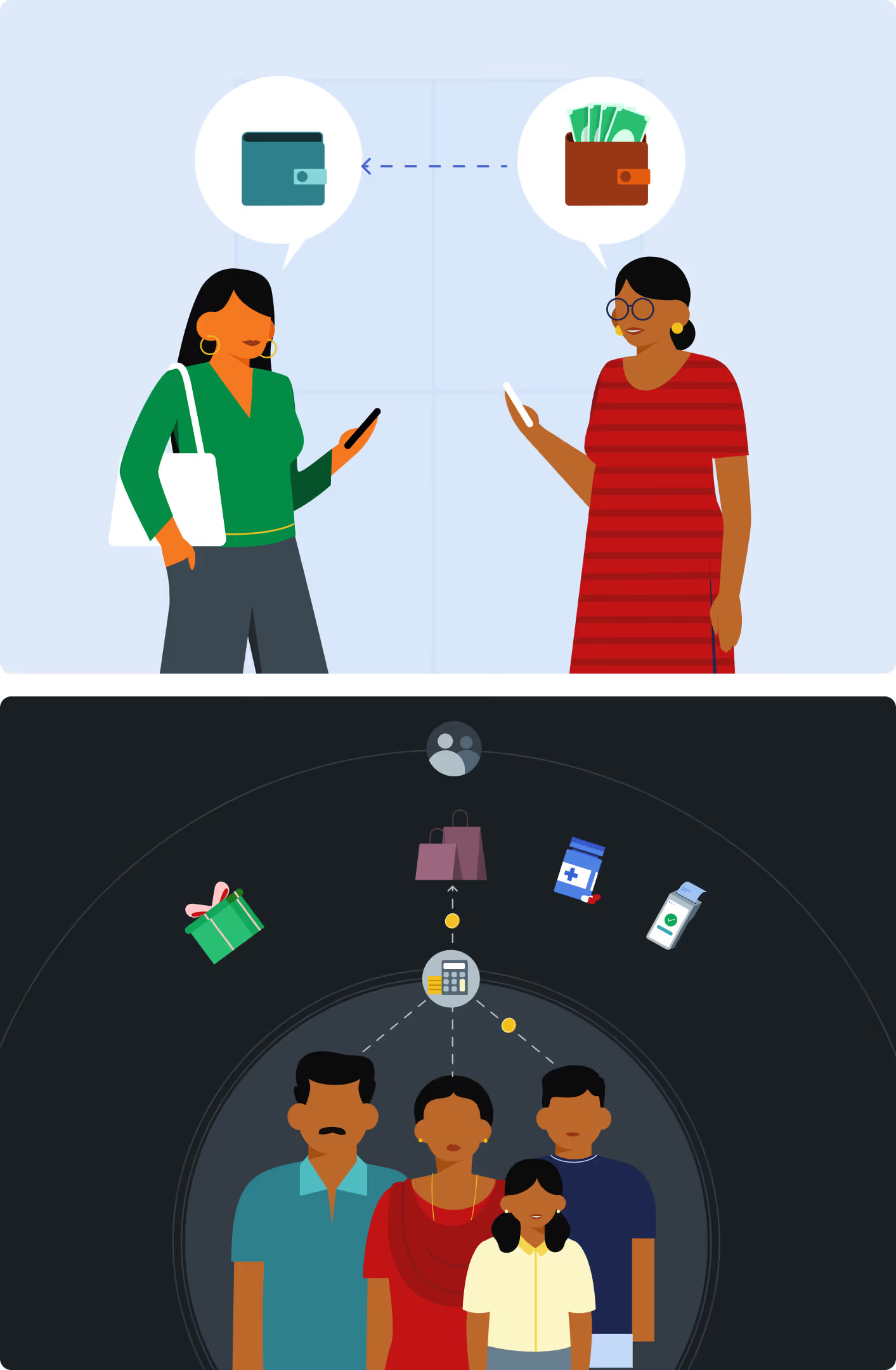

Dense information was structured compactly to ensure scannability and efficient readability.
Key sections and critical data were placed above the fold for maximum accessibility and control.
Key sections and critical data were placed above the fold for maximum accessibility and control.
Semantic colours and illustrations established outcomes and nudged users to explore products and offers.
Semantic colours and illustrations established outcomes and nudged users to explore products and offers.
Custom visuals simplified fintech concepts, enhanced trust, and supported inclusive user experiences.
Custom visuals simplified fintech concepts, enhanced trust, and supported inclusive user experiences.
Dense information was structured compactly to ensure scannability and efficient readability.
Dense information was structured compactly to ensure scannability and efficient readability.
The outcome was a seamless, accessible & human-centered product experience designed for inclusivity & scalability, rooted in a simplicity-first design strategy.
designs to validate acceptance
design system with dual theme support
approach to ensure consistency
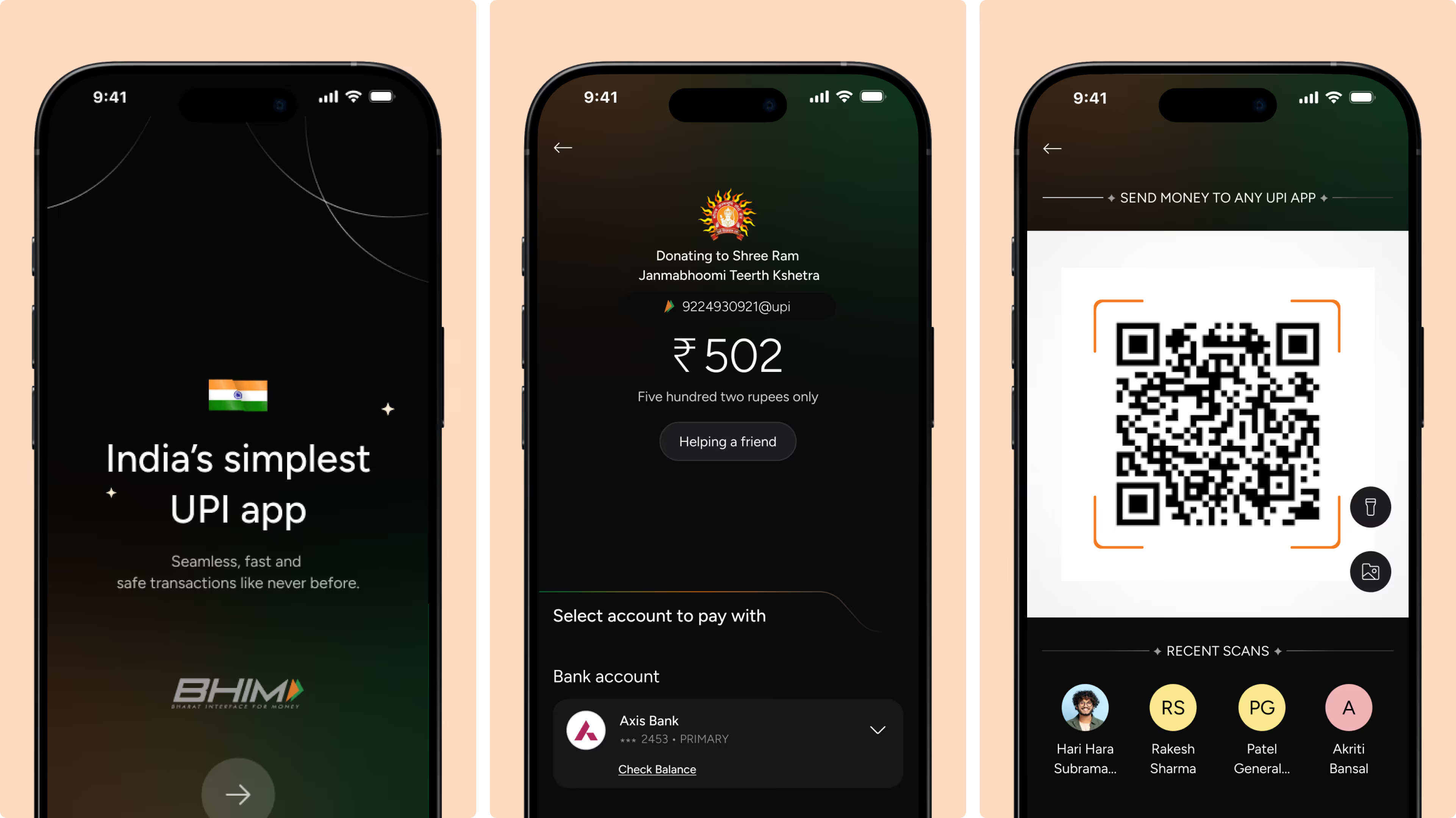
End-to-end onboarding, authentication, and core payment flows (security setup, transactions, QR scan) to enable a seamless and secure UPI experience.
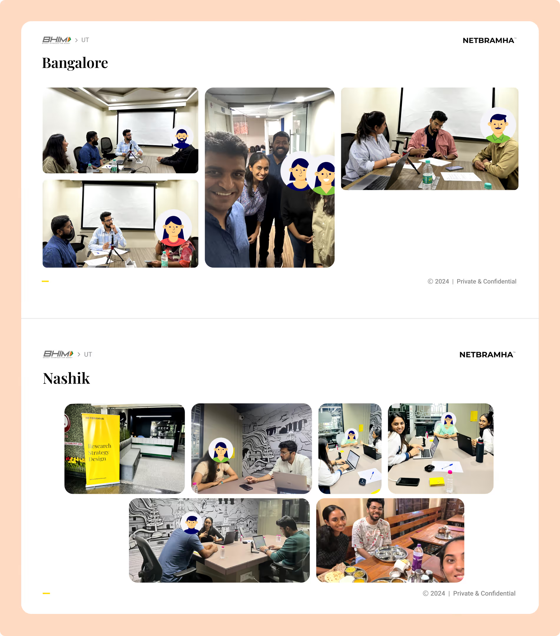
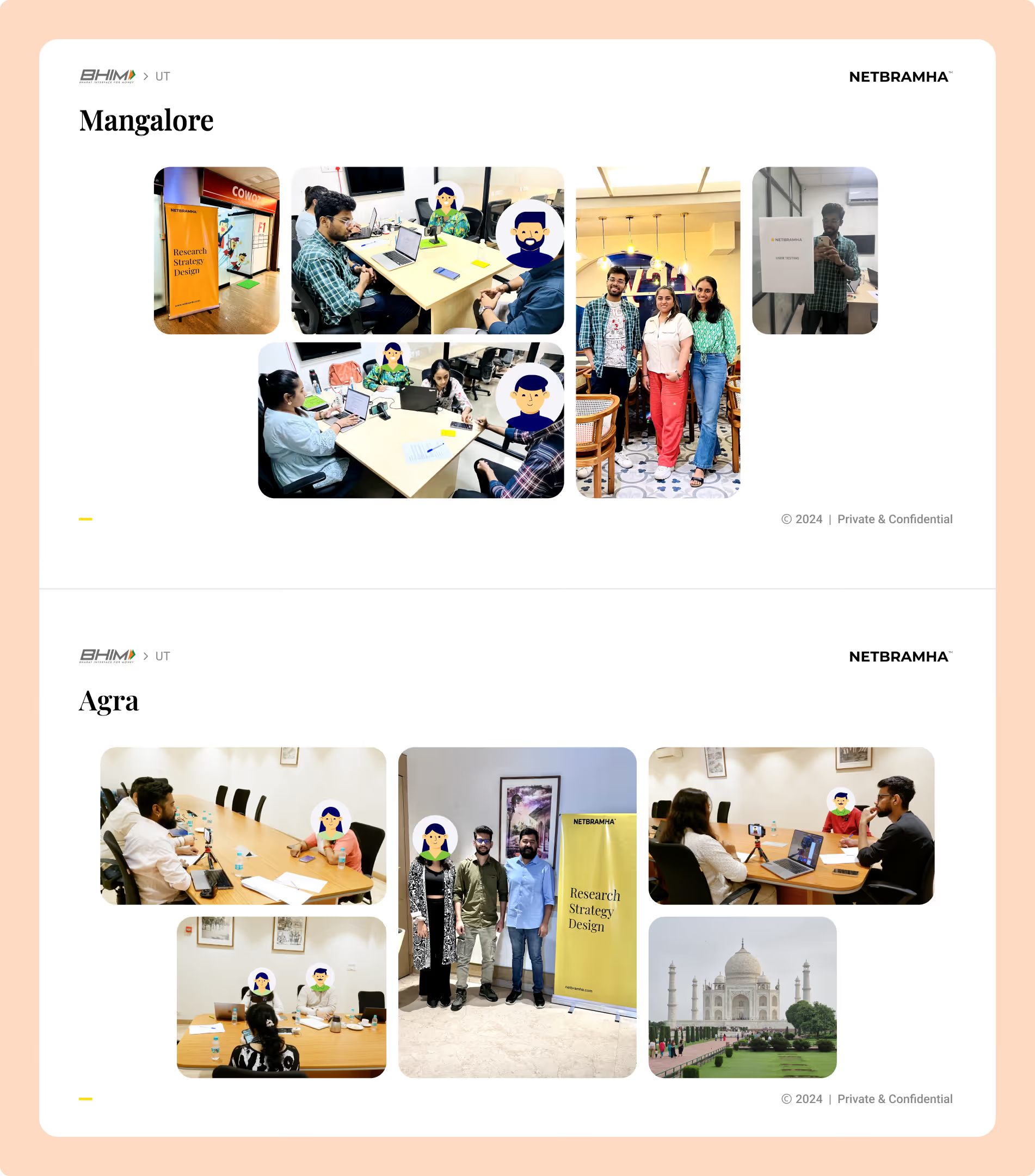
Exhaustive in-person user research & testing, conducted in major parts of the country across Metro, Tier 2 & Tier 3 cities, with various demographics to gain both quantitative and qualitative data to validate the design decisions.
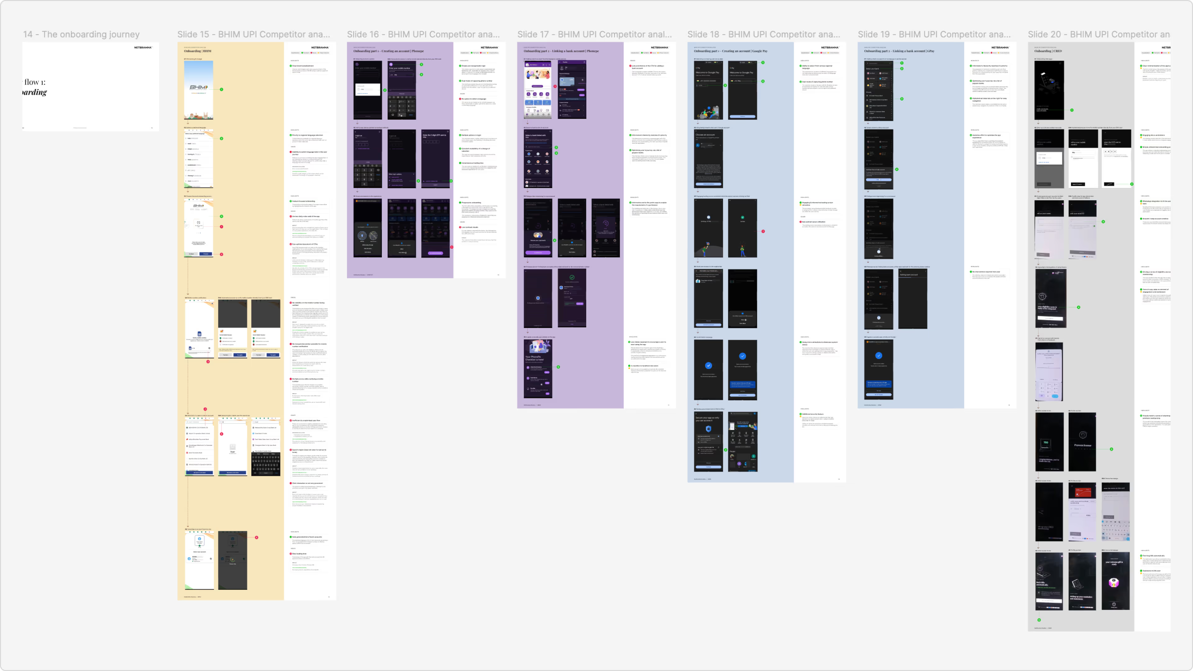
Competitive benchmarking for key journeys across leading players in the market to derive best practices and get a deeper understanding of their first principles.
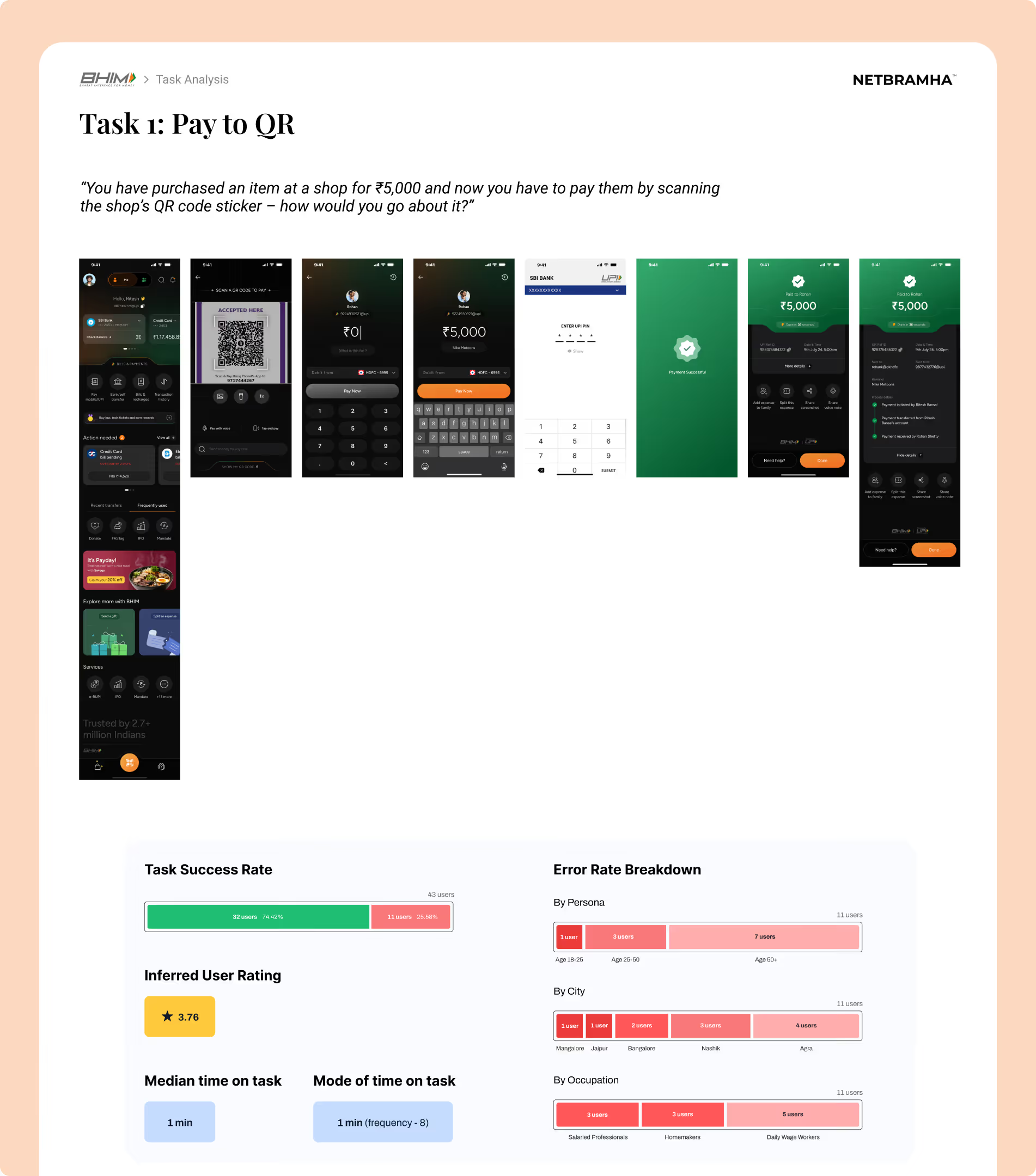
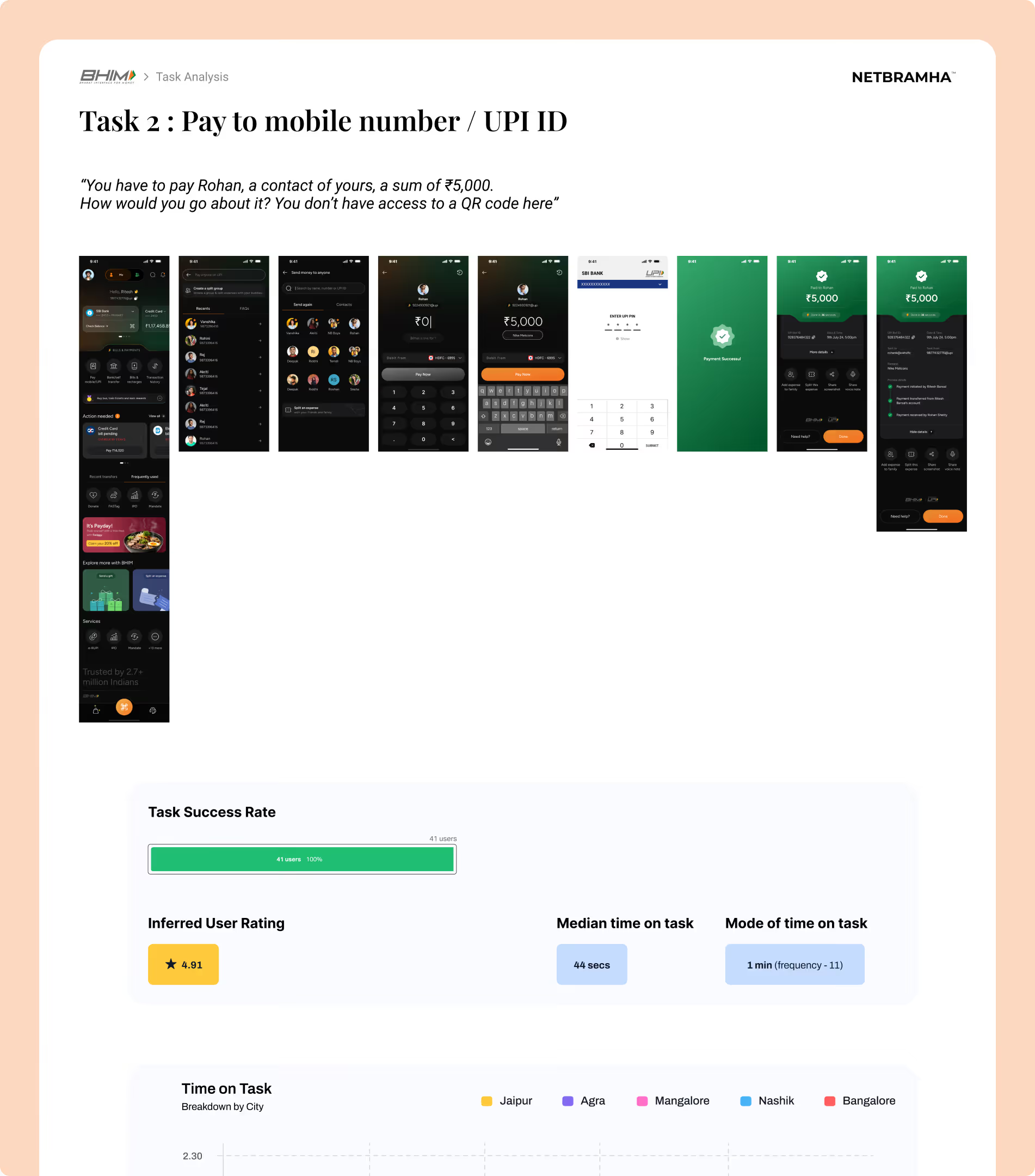
Simplicity-first strategy improved task success rates, reduced errors, and enabled intuitive, inclusive payment experiences through streamlined flows and engaging features.
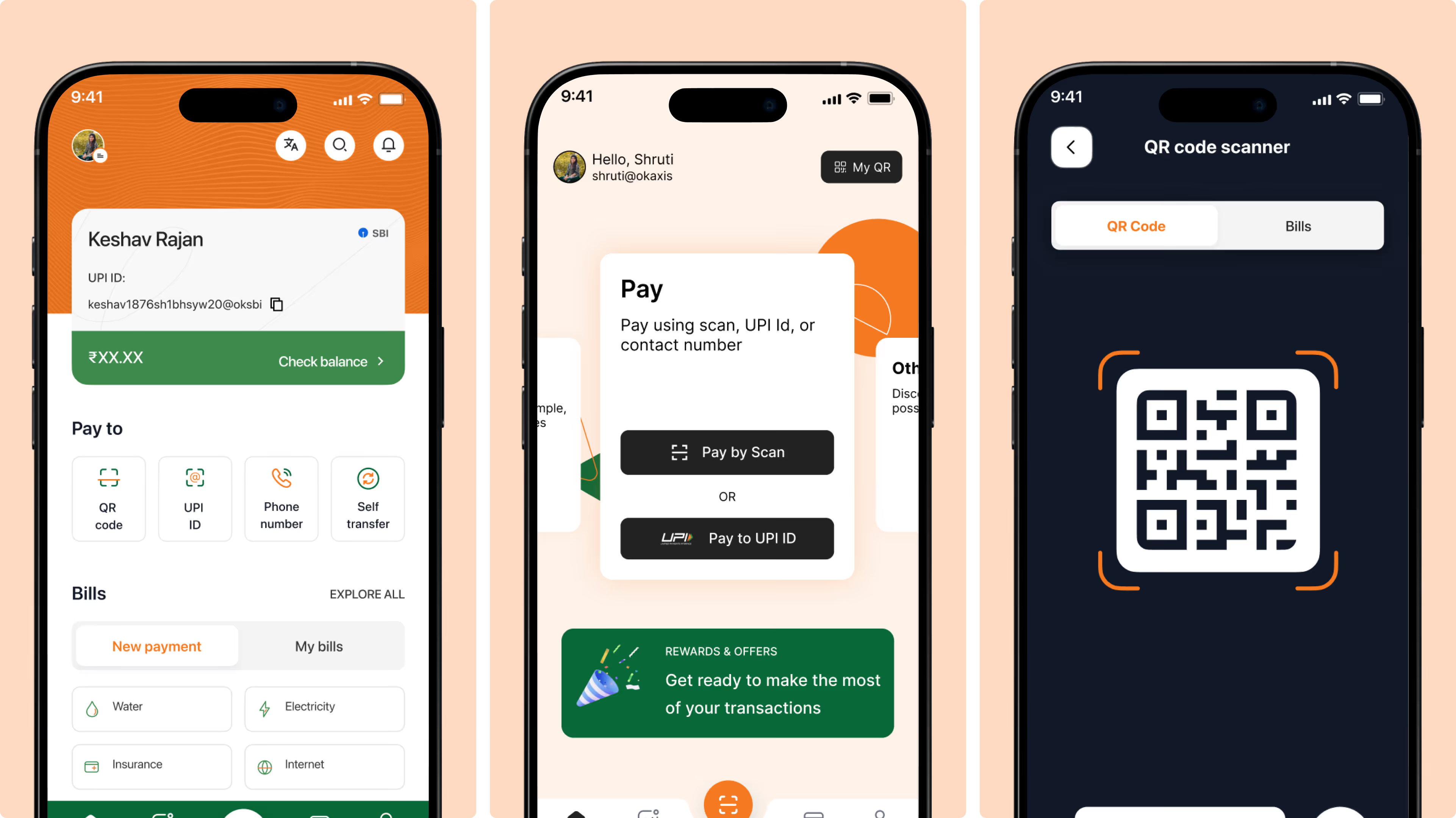
Multiple iterations refined colors, typography, and imagery to create a clear, accessible, trustworthy, and modern visual experience.
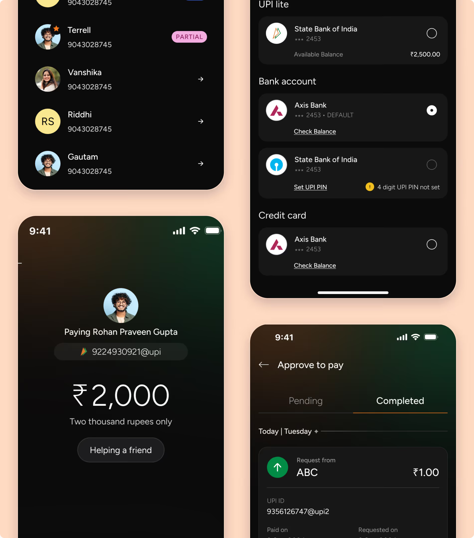
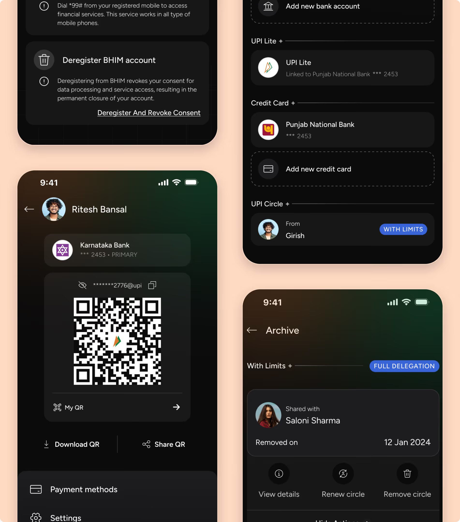
Redesign improved perception, boosted engagement and retention, expanded accessibility, and tripled transactions, establishing BHIM as an inclusive, scalable fintech platform.
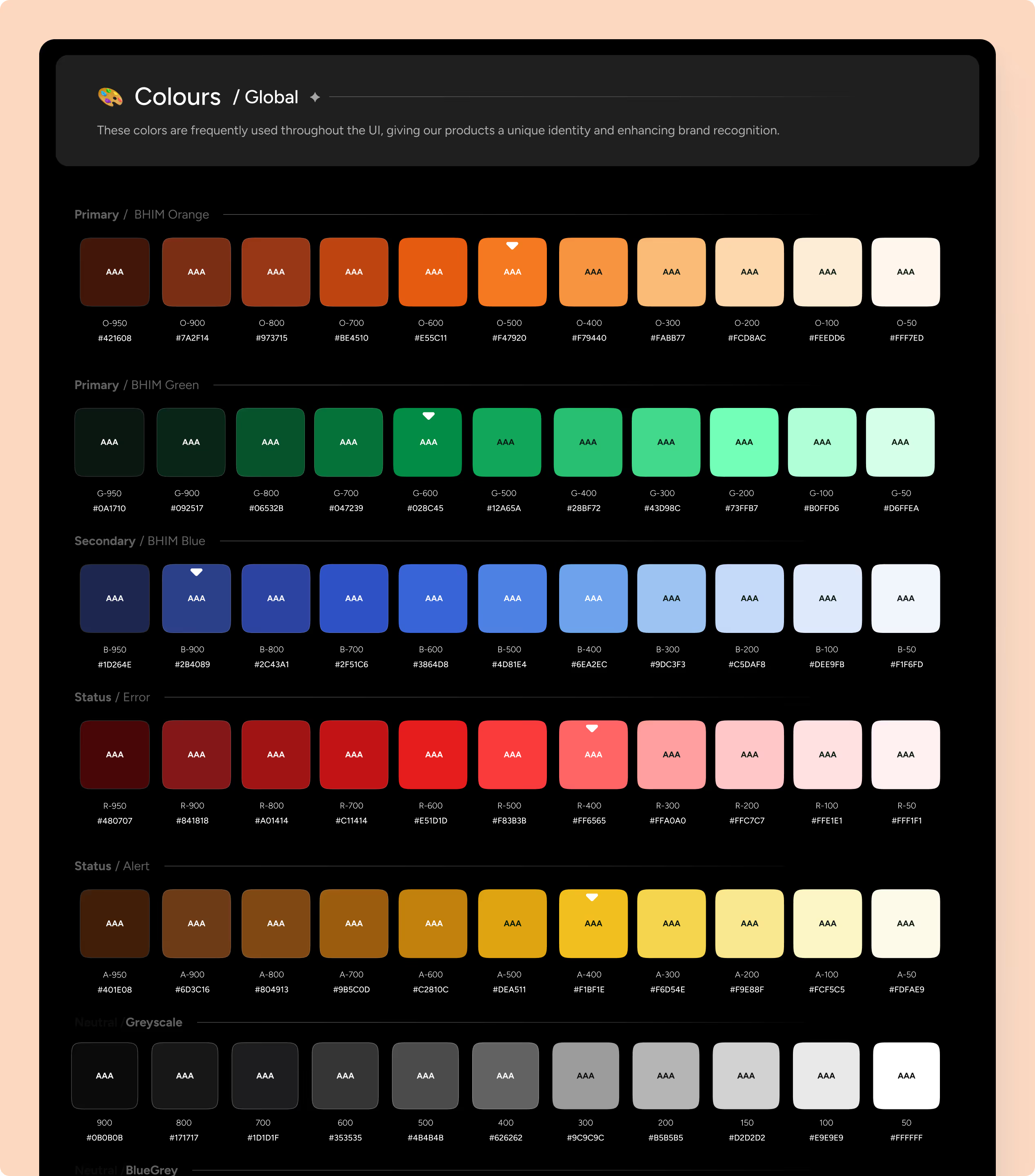
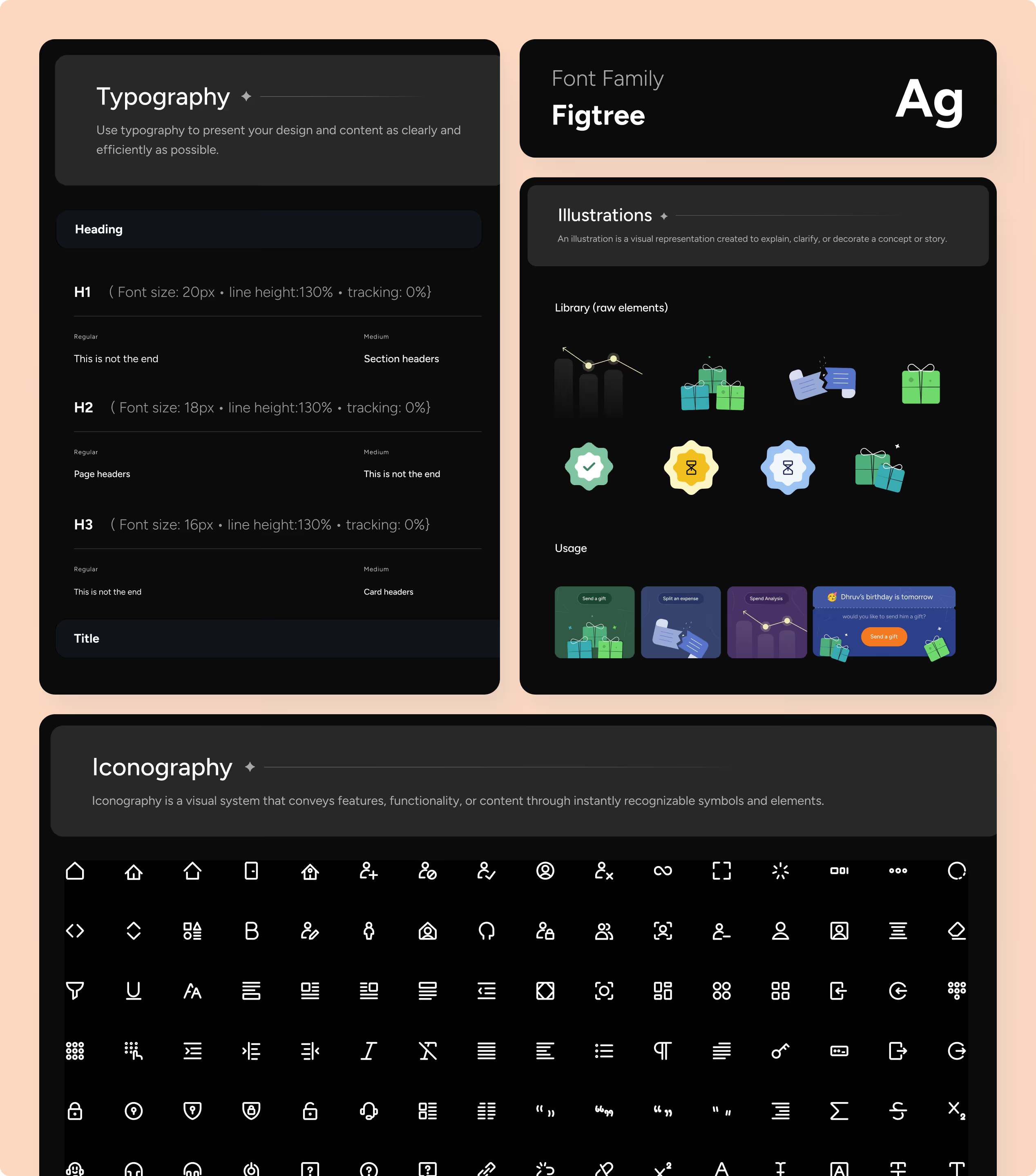
Designed a foundational design system (colors, typography, iconography, illustrations) to establish a consistent and accessible visual language.
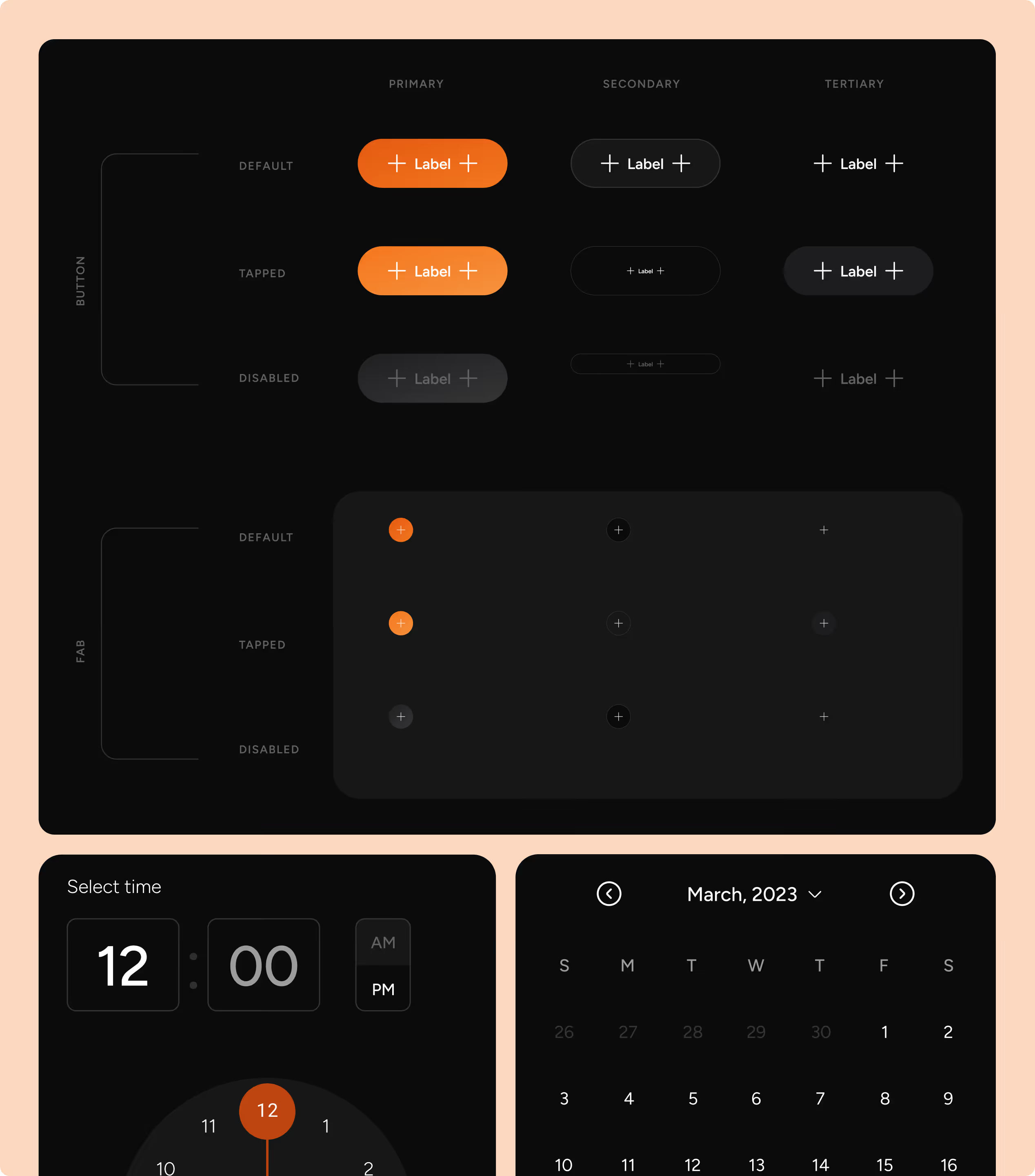
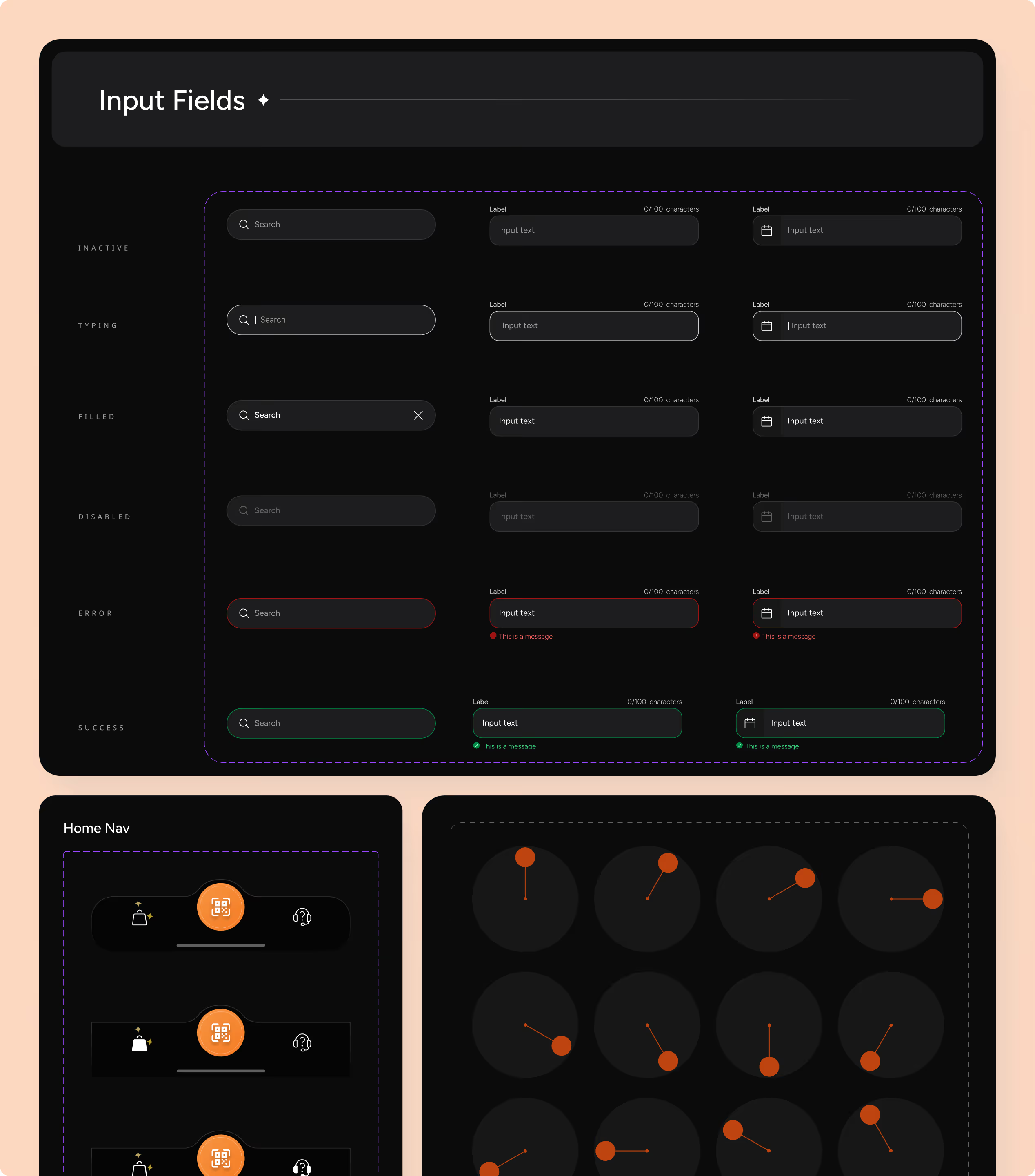
Scalable component system with standardized UI patterns (forms, buttons, navigation, selectors) to ensure consistency and efficiency across the product.


NetBramha Studios designed the user experience for BHIM (Bharat Interface for Money), the UPI payments app built and owned by NPCI, the National Payments Corporation of India, under the Government of India's Digital India programme.
NetBramha's redesign drove a 3× increase in transaction volume and 10 million downloads in BHIM's first 10 days alone. That combination of scale and public accountability puts BHIM in a different category from a typical fintech app redesign - the interface had to work for someone using a smartphone for the very first time.
NetBramha rebuilt the core transaction flow, simplified the information architecture, and rethought BHIM's onboarding so a first-time UPI user could complete a payment without prior digital-payments experience.
That first-time-user constraint is the throughline across NetBramha's Indian fintech work: the same discipline shows up in how HDFC Bank's mobile banking app and ONE Muthoot's gold loan platform were simplified for customers who aren't digital-first by default.
Most enterprise UX portfolios are built entirely on private-sector work. BHIM is a rare exception: a national-scale, government-owned product where the design decisions were reviewed against public accountability standards, not just a single brand's guidelines.
It sits alongside NetBramha's other large-scale Indian fintech infrastructure work - TransUnion CIBIL, which carries credit records for 500M+ Indians, is the closest comparison in terms of the sheer number of people who depend on the product working correctly.
The interaction patterns NetBramha established for BHIM's core payment flow - the minimal-step confirmation, the simplified beneficiary selection - became reference points that later UPI apps built on as the category matured.
That's a different kind of impact than a single client's growth number: it's evidence the work held up as a category-defining pattern, not just a one-off. NetBramha's Razorpay Magic checkout redesign later worked from the same principle of collapsing a financial transaction into the fewest possible steps.
Scale at BHIM's level means designing across 22 official languages, connectivity ranging from 2G to 5G, and a user base where a meaningful share are completing their first digital transaction of any kind on this exact screen.
Very few design studios globally have shipped a production interface at that population scale with that combination of constraints. It's the clearest evidence in NetBramha's portfolio that its process holds up outside the assumptions most enterprise software is designed under.
Yes. NetBramha designed the UX for BHIM, developed by NPCI under the Government of India's Digital India initiative, making it one of the few private studios to shape a national-scale government product.
The same research-and-design approach shows up in Razorpay Magic (Payments), which faced a related set of constraints. NetBramha tends to reuse validated methodology across engagements rather than starting from a blank process each time, which is part of why these case studies read as consistent rather than one-off wins.
The interaction patterns NetBramha established for BHIM's transaction flow went on to shape UX conventions later adopted across India's UPI ecosystem, including PhonePe, Google Pay, and Paytm. Two further examples worth reviewing are ClearTax (Fintech) and HDFC Bank (BFSI), both from the same part of NetBramha's portfolio. Together with this case study, they give a fuller picture of the range NetBramha covers rather than relying on one project as proof.
Recommended Next

.avif)