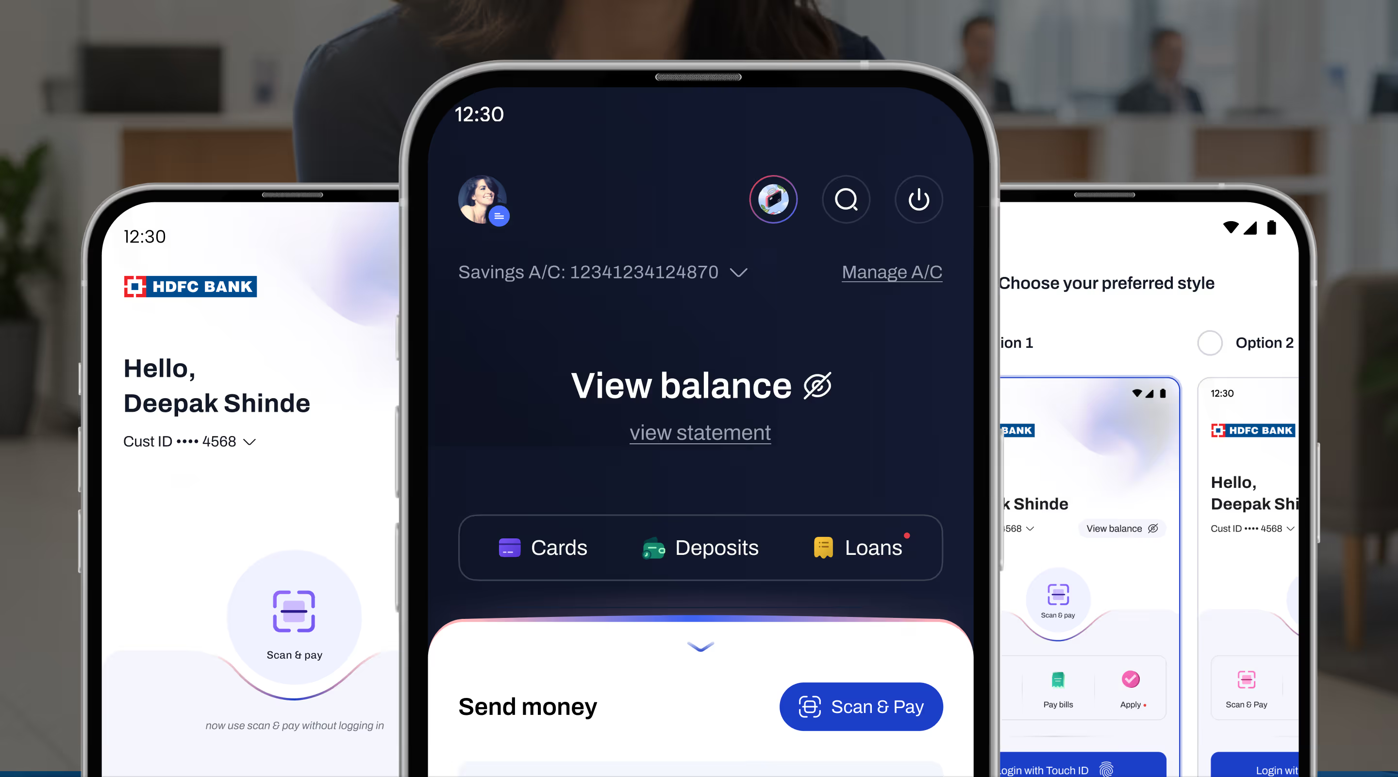
HDFC Bank’s legacy mobile app, used by over 60 million customers, faced usability challenges including a cluttered interface, disjointed navigation and inconsistent interactions.
Traditional banking workflows felt tedious, prompting users to rely on third-party apps for everyday tasks. The redesign aimed to make banking feel effortless, inclusive and modern.
Our mission was to redesign the HDFC mobile banking experience to improve usability and simplify core banking journeys across accounts, payments, and transfers.
by reducing steps for key financial actions like transfers and payments.
through clearer hierarchy, interaction feedback, and discoverable features.
by structuring journeys that resolve more user goals without friction.
empowering internal teams to rapidly build and extend experiences.
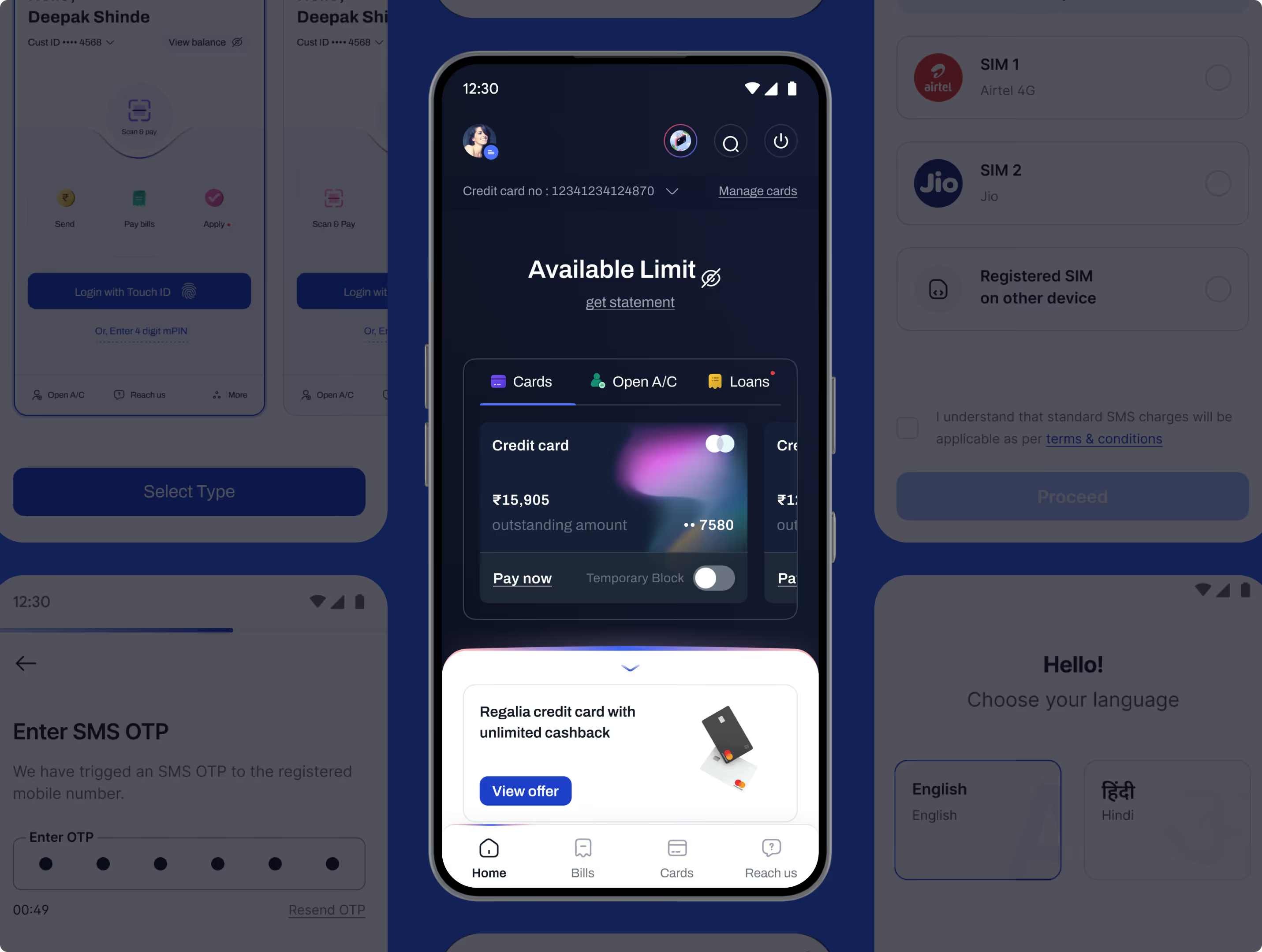
Designed intuitive card interfaces with clear hierarchy, visual clarity, and seamless actions to enhance usability and accessibility.
Personas for India’s multigenerational audience restructured information architecture, reducing cognitive load and streamlining payments, transfers and account management.
A cohesive design language improved usability with smart shortcuts, bottom navigation, micro-interactions and unified patterns, reducing transaction anxiety.
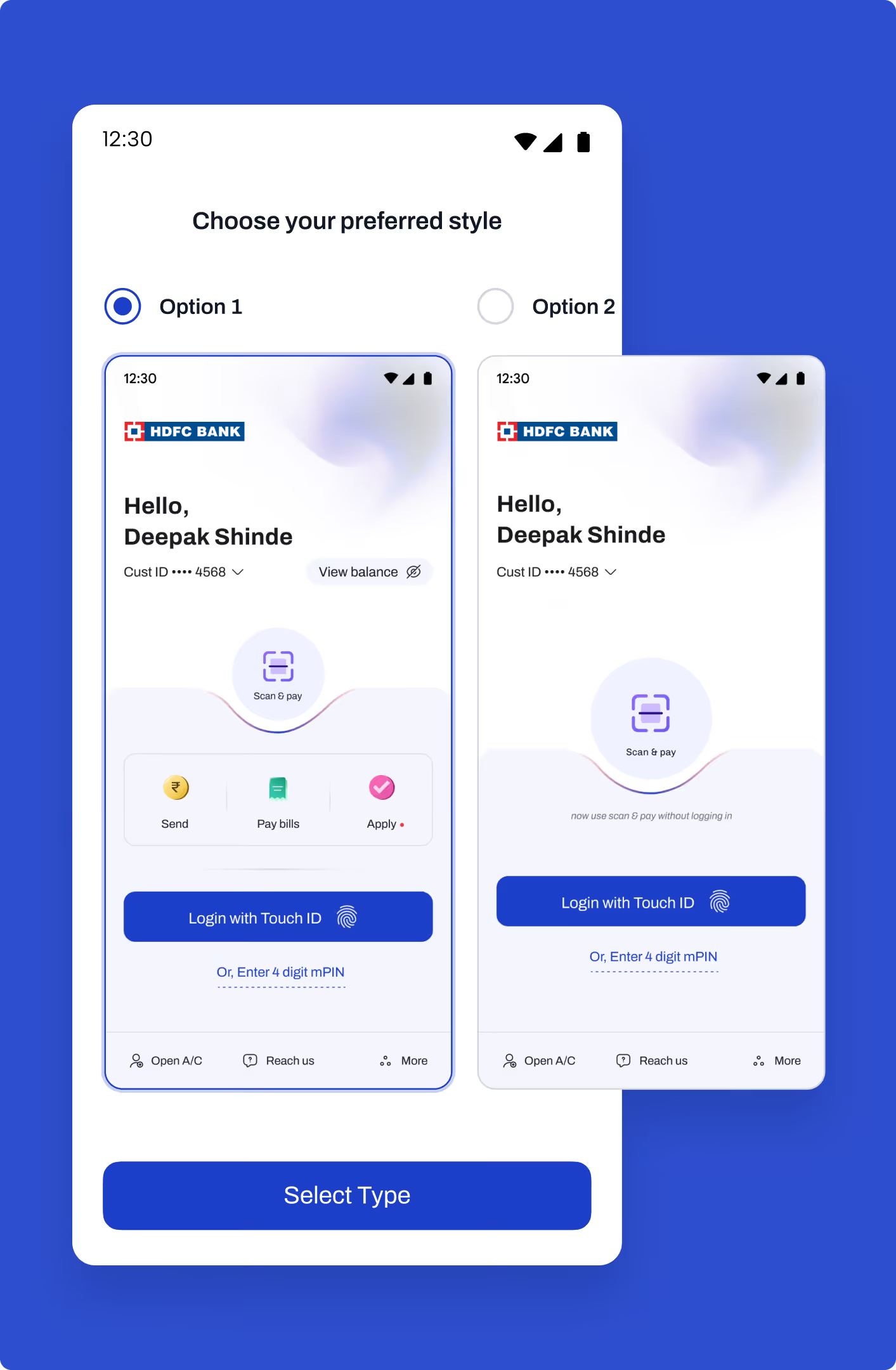
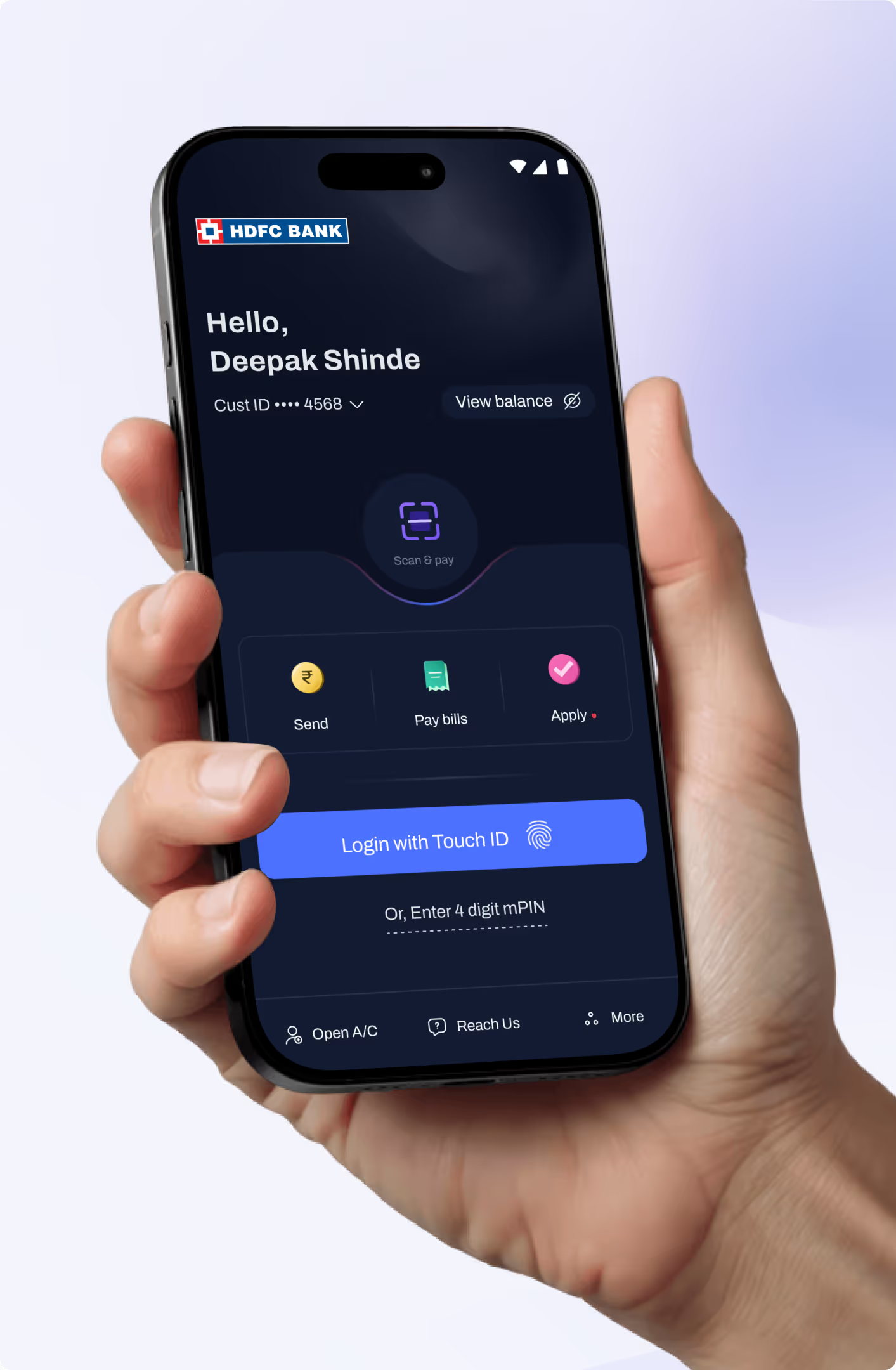
Designed flexible login selection with clear options, enabling faster, secure access while improving usability and reducing authentication friction.
Wireframes and visual designs streamlined login and registration flows with clear hierarchy and cohesive UI.
Designed intuitive card interfaces with clear hierarchy, visual clarity, and seamless actions to enhance usability and accessibility.
Designed intuitive card interfaces with clear hierarchy, visual clarity, and seamless actions to enhance usability and accessibility.
Personas for India’s multigenerational audience restructured information architecture, reducing cognitive load and streamlining payments, transfers and account management.
Personas for India’s multigenerational audience restructured information architecture, reducing cognitive load and streamlining payments, transfers and account management.
A cohesive design language improved usability with smart shortcuts, bottom navigation, micro-interactions and unified patterns, reducing transaction anxiety.
A cohesive design language improved usability with smart shortcuts, bottom navigation, micro-interactions and unified patterns, reducing transaction anxiety.
Designed flexible login selection with clear options, enabling faster, secure access while improving usability and reducing authentication friction.
Designed flexible login selection with clear options, enabling faster, secure access while improving usability and reducing authentication friction.
Wireframes and visual designs streamlined login and registration flows with clear hierarchy and cohesive UI.
Wireframes and visual designs streamlined login and registration flows with clear hierarchy and cohesive UI.
We redesigned HDFC Bank’s mobile experience to simplify everyday banking, reduce user effort, and create a scalable foundation for future digital growth.
core banking journeys streamlined
Design system & interactions
and intuitive mobile experience
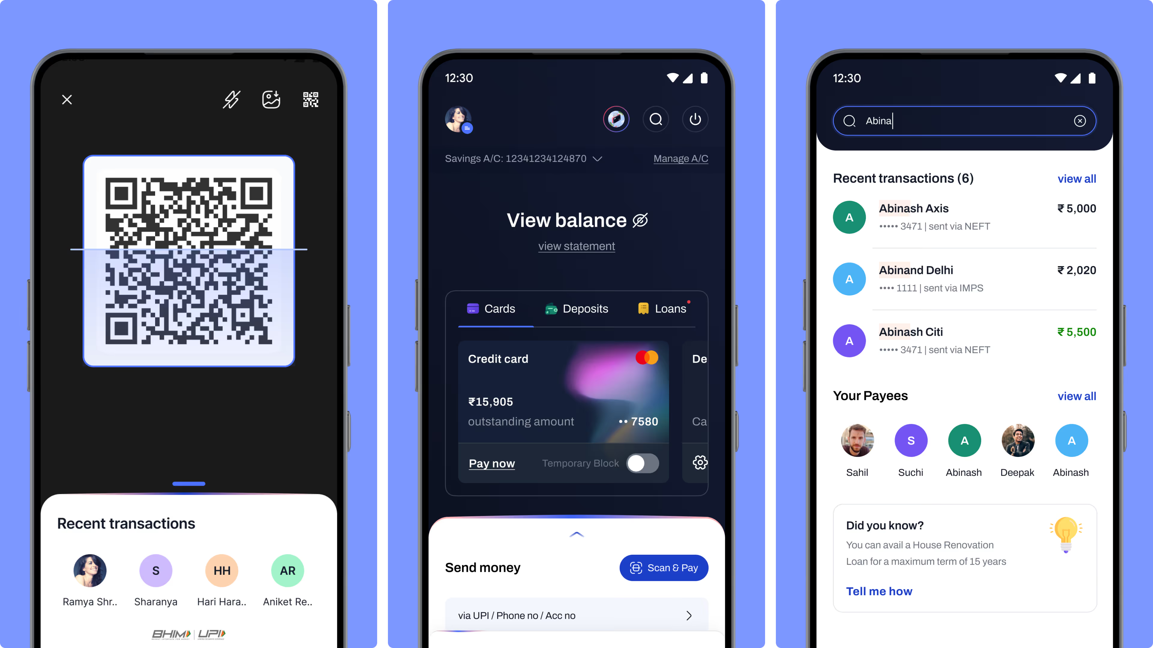
Designed QR, balance, and transaction screens with clear hierarchy and intuitive information flow for seamless usability.
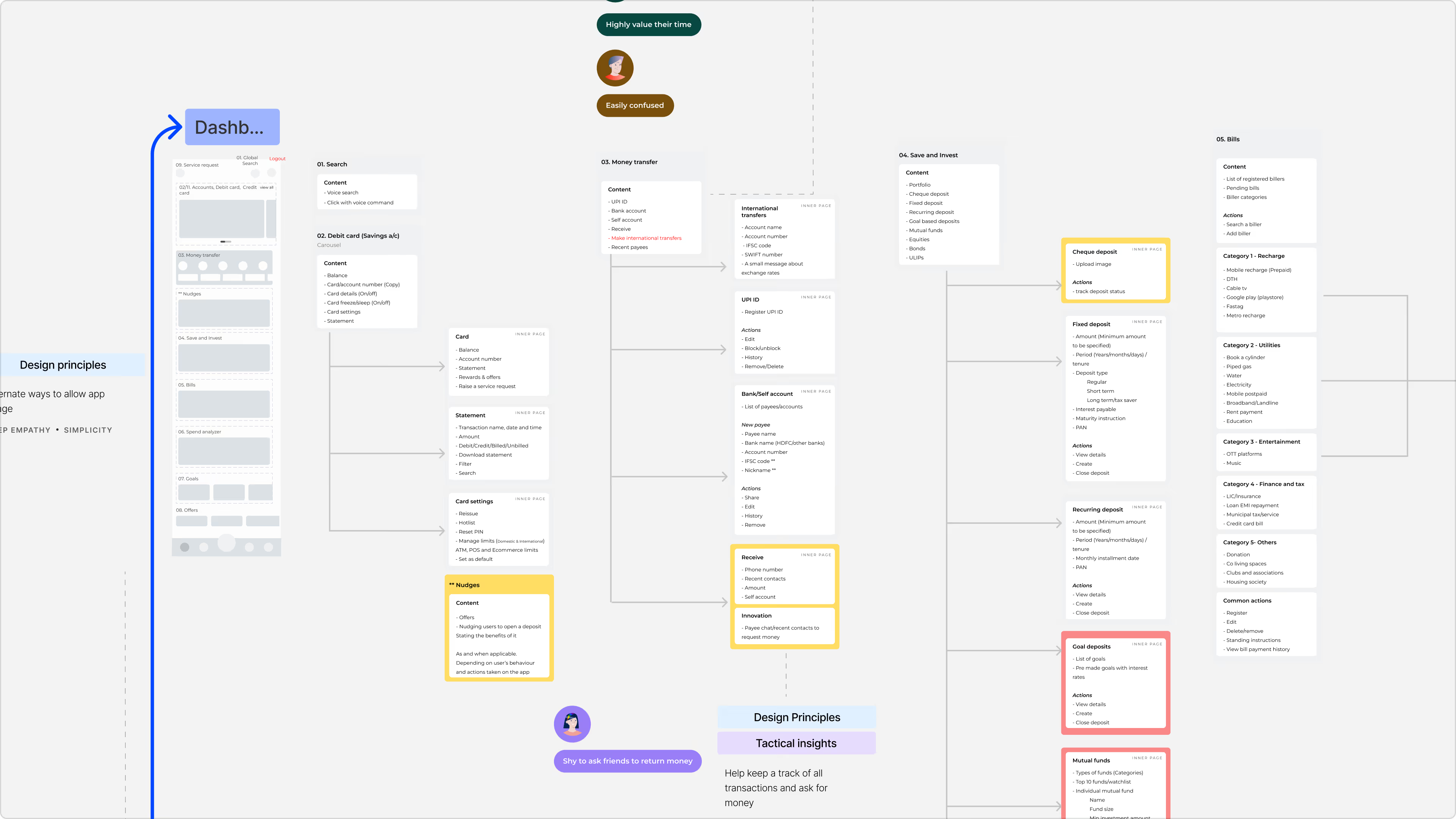
Structured information architecture and wireframes simplified navigation, organized features logically, and enabled intuitive user journeys across the app.
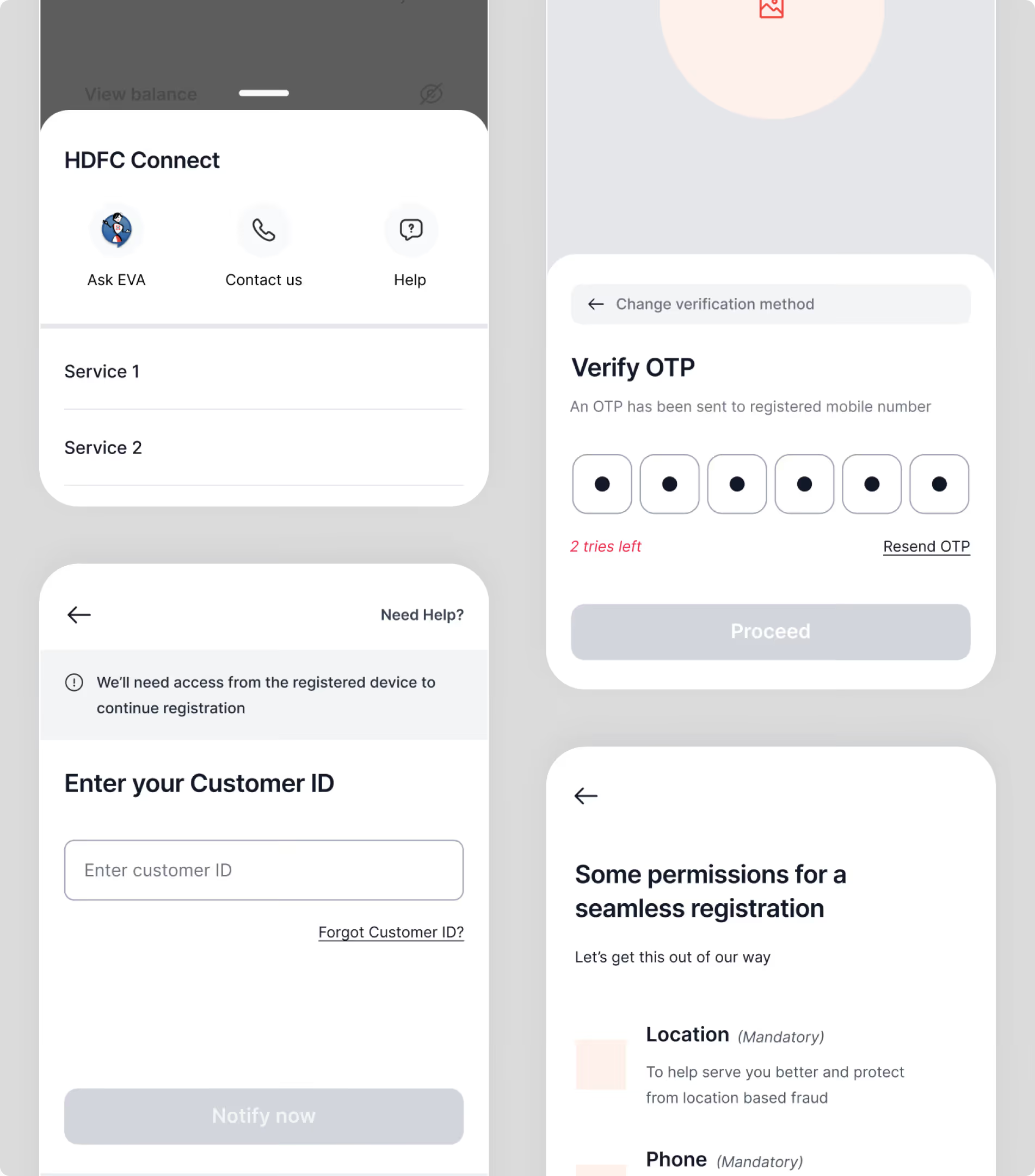
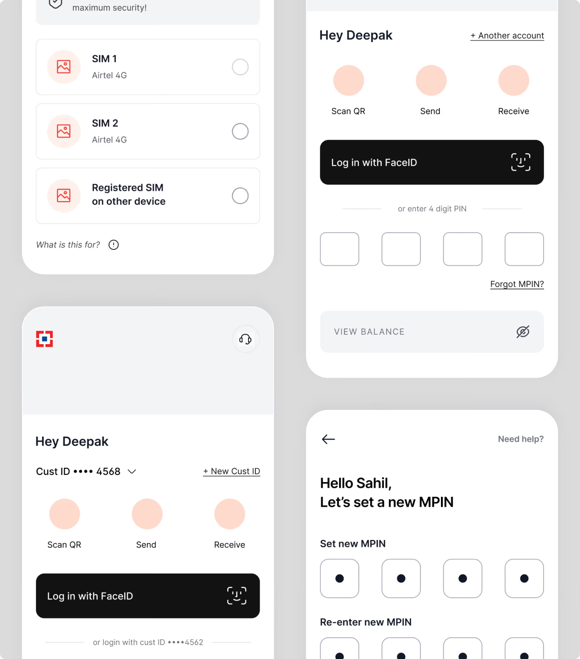
Created wireframes to define layout structure, navigation flow, and content hierarchy for a seamless, intuitive user experience.
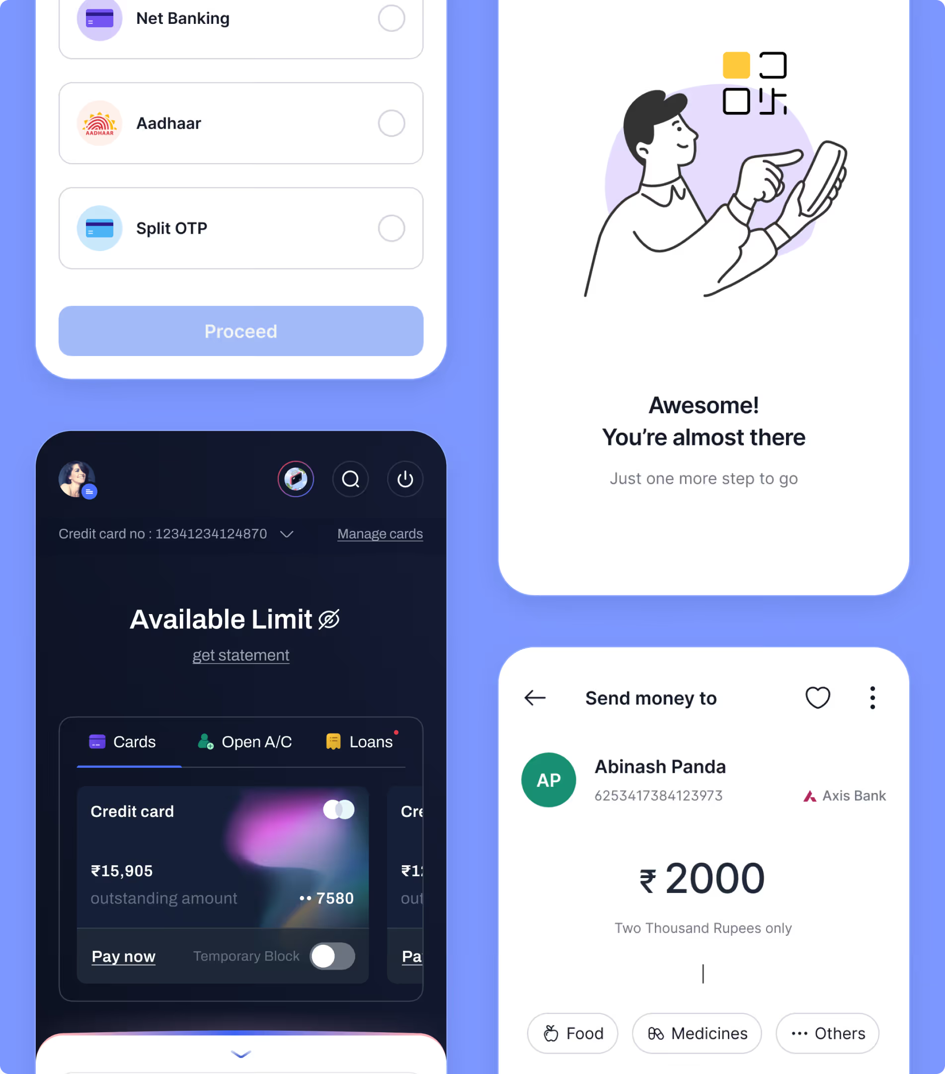
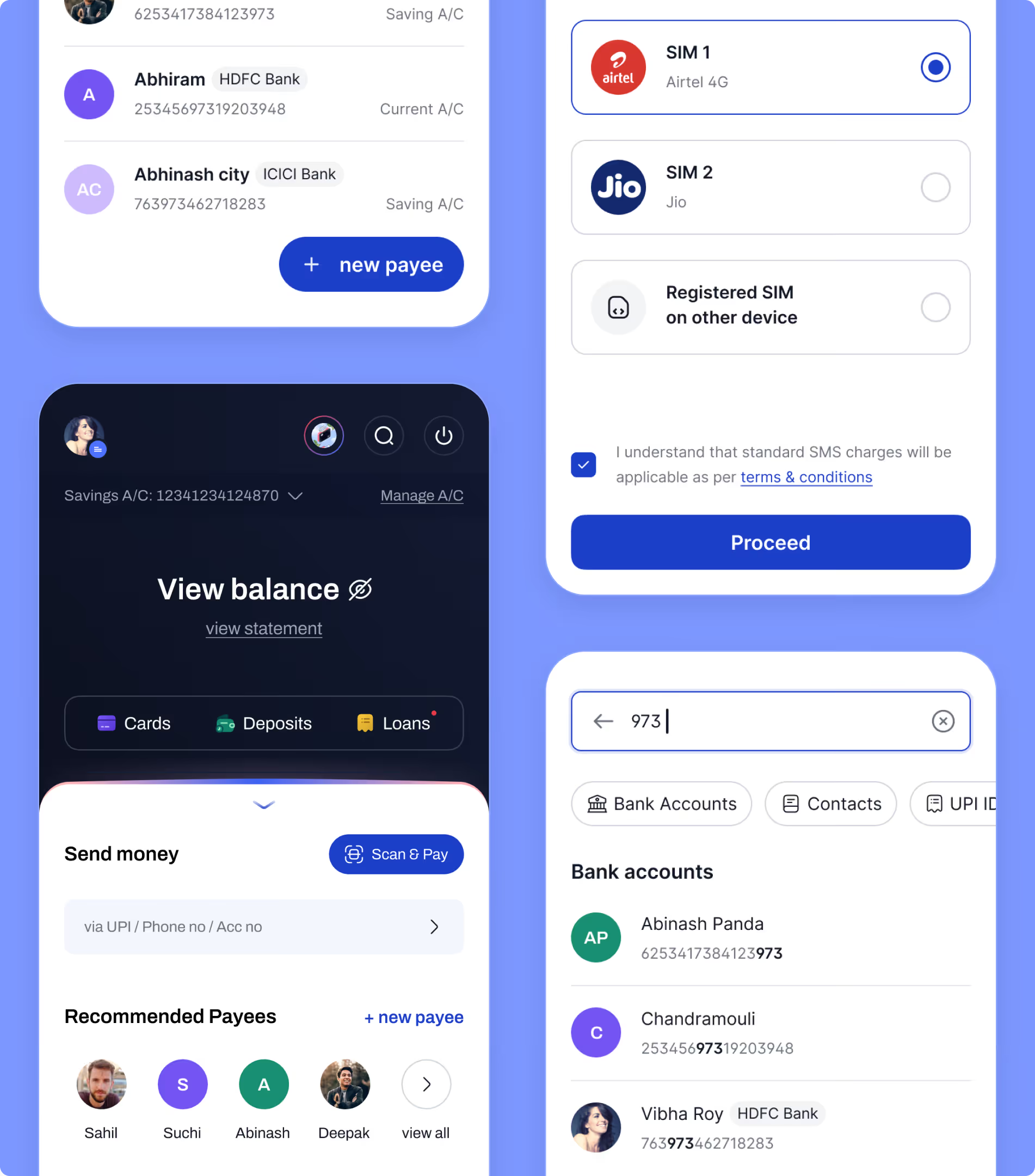
Translated wireframes into visual designs using consistent components, clear hierarchy, and cohesive styling aligned with HDFC’s design system.
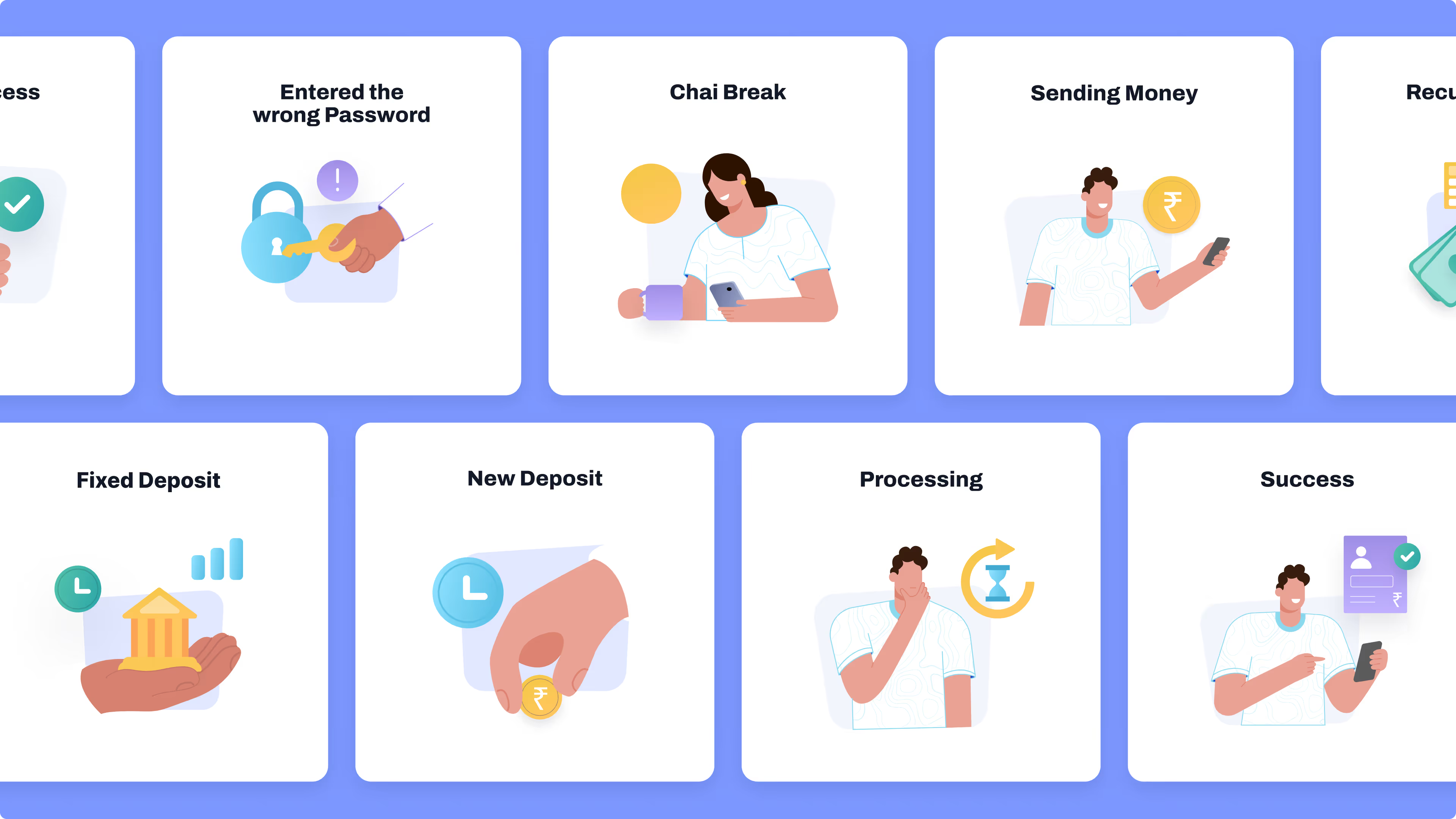
Incorporated illustrative visuals within interfaces to improve clarity, guide actions, and strengthen a consistent visual language.
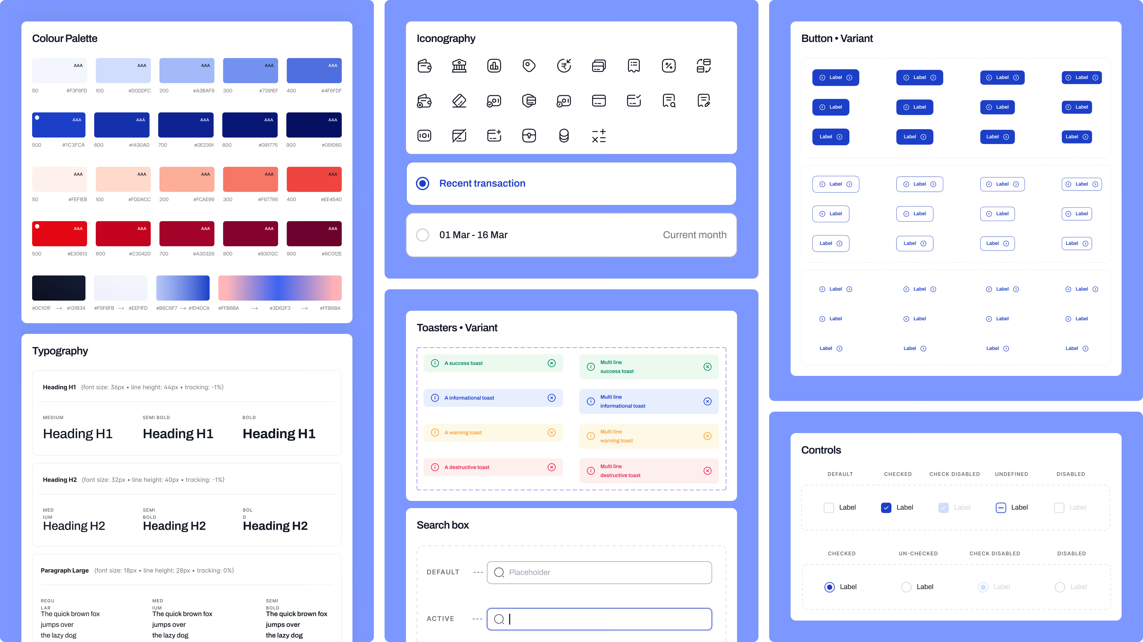
Established a consistent design system with iconography, buttons, and typography to ensure clarity, scalability, and cohesive user experience.


NetBramha reworked HDFC Bank's core mobile banking flows - fund transfers, account management, and service requests - for India's largest private-sector bank by market capitalisation.
The brief wasn't a visual refresh. HDFC Bank's existing app carried years of accumulated feature debt, and the redesign had to reduce friction without removing functionality a customer might depend on - the same balancing act NetBramha faced on Geojit's trading platform, where experienced traders and first-time investors share one interface.
A bank the size of HDFC carries regulatory constraints, legacy backend integrations, and a customer base ranging from digitally fluent urban users to first-time mobile banking adopters, all inside one interface.
That's a structurally different problem than designing a startup app from a blank slate. NetBramha's BHIM redesign for NPCI faced the same tension at even larger scale - both projects had to serve advanced and first-time users without maintaining two separate interfaces.
Yes. Beyond HDFC Bank, NetBramha has designed for BHIM (NPCI),
ONE Muthoot (India's largest gold loan NBFC), TransUnion CIBIL (credit scoring for 500M+ users), and Yubi (India's largest corporate debt marketplace) - covering banking, NBFC, credit, and institutional debt in one portfolio.
Every additional screen or unclear label in a banking app increases the odds a customer calls support instead of self-serving. At HDFC's scale, even small friction reductions in high-frequency flows like transfers translate into meaningfully fewer support contacts.
NetBramha's telecom self-service work for ACT Fibernet was built on the identical logic - reduce support-driving friction in the highest-traffic flows first, since that's where the return on design investment compounds fastest.
Both. HDFC Bank was an existing, live product with years of legacy UX debt to work around. Elsewhere in NetBramha's portfolio, projects like Planera and Gyaan.ai were built from a blank canvas with no legacy constraints at all.
The bank-redesign skill set and the 0-to-1 build skill set require different disciplines - one is about careful subtraction, the other about establishing a pattern from nothing. NetBramha's GODai brand and product build is the clearest example of the latter, built from zero with no existing product to react to.
Recommended Next

.avif)