.avif)
To end this, James Ritty, found an unlikely inspiration from a steamboat’s propeller & thus prototyped the first ever keypad design.
By Hari Hara Subramaniam, Senior Product Designer at NetBramha Studios
If you are a designer, here’s a fun task for you.
Without looking it up anywhere, can you correctly visualize a telephone’s keypad & a calculator’s keypad? Did you realize that both are opposite to each other? While the telephone starts with the keys 1-2-3 at the top , the calculator starts with these digits at the bottom.

As a designer, I have always felt intrigued as to why such a stark difference existed between these two interfaces, even though they are used roughly for the same purpose – typing in numbers.
Finding the answer to this question took me down a rabbit hole, replete with theories, stories & urban legends – & today I want to share some of my key findings with you all.
1879, Salon-owner James Ritty in Ohio realized that some of his employees were stealing his stack of money. To end this, James Ritty, a man with a vivid imagination & strong designer skills found an unlikely inspiration from a steamboat’s propeller & thus invented a machine that consisted of a clockwise device with a set of numeric keys. Which means, the first ever prototype of modern-day keypad design was not the cash register (as most of you may think) but an in-house thief-catching contraption devised by a maverick saloonist.
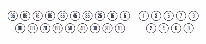
Until 1983, the earliest types of cash register models were buttons commonly arranged in one or two horizontal rows, which corresponded to present values such as — 10, 15, 20, 30, 35; numbers that correlated to the price of items in the salon.
1884, Dorr Felt – famous American inventor & industrialist would go on to invent the Comptometer, an early computing device & the 1st ever printing adding machine. Dorr Felt felt (pun unintended) that machines were capable of solving more complex problems rather than just summing up daily groceries count.
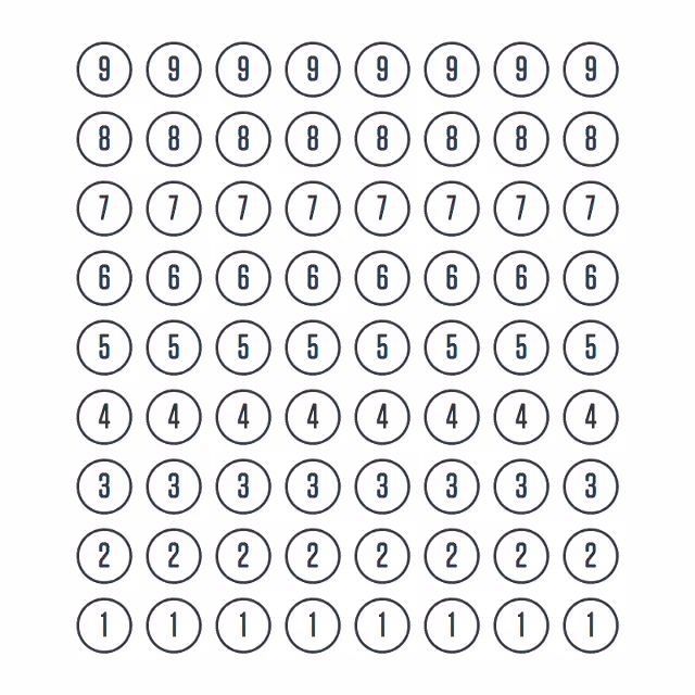
So, based on the Pasacline’s mechanism, the layout of Thomas Mill’s machine and a macaroni box, Dorr Felt built the Comptometer – a device with eight columns of keys that range from 9 (on top) to 1 (on bottom) where each column represented a decimal position. (Important: 0 was yet to make its debut in the keypad interface design biz)
With the turn of the century, in 1902, Dalton became the first computing device to include the long elusive zero. A miniature ancestor of the modern day typewriter, Dalton had a unique way of arranging the digits – 24579 at the top and 13068 at the bottom. Despite the odd arrangement (or maybe because of it!) Dalton became an instant hit with bookkeepers all over the world.

1914, the year when the world witnessed the First World War, David Sundstrand filed the patent for his innovative numbers adding device, one that pushed the usability of these machines a few notches higher. For the first time, the numbers were arranged in a 3X3 layout, something which Sundstrand believed was “more logical & natural”.
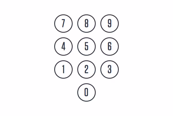
This layout had the digits 7,8,9 at the top row & 0 at the very bottom. The efficacy of this layout was attributed to the fact that it could be easily operated with one hand. And thus, the prototype for the modern day calculator was born.
Did the evolution of calculators (digit-adding keypads) have an effect on how the keypad for telephones were designed?
Yes and no.
Because while on one hand, the keypad interface design was undergoing massive transformations based on the key (pun intended) functions (from nabbing saloon thieves to the savior of bookkeepers), on the other hand, parallelly the telephone invention overlords were on the pathway to inventing push-button phones, way back in 1887. It was during this time that the rotary dialing keypad came into existence.
But it wasn’t until the post-WW 2 era (the 50s & the 60s), when engineers & science folks really started paying attention to all the ways the digits could be arranged in a keypad. Based on the numerous layouts & configurations, AT&T (along with the complete host of inventors) started thinking in terms of user-first – what would be the best, easiest, & most natural way for the users to interact with the keypad.
So here we have tons of experiments going on with different shapes & layouts – triangular, circular, pyramidal, & the likes. Out of the 15 or so different arrangements, including the one with the calculator-like alignment (starts with 7,8,9), interface design experts realized that the users preferred “left-to-right” & “top-to-bottom” layouts more than the others.
There are a diverse range of factors that influence these design decisions
As designers you must be well aware of the fact that out of all the above factors, the last one “familiarity with existing formats” is the strongest one driving digital design conventions in the current day & age.
In particular the two alignments that stood out in terms of ease-of-use were the 3×3+1 layout and the 5+5 layout – with the 3×3 (aka modern day telephone) having a marginal edge over the other because of its more compact size.
https://youtu.be/a9I0lwxiHpg
Digital interfaces & designs are free from the limitations of physical designs – no levers or pulleys or rotational mechanics come into play when designing any “contraption”. Which means the only reason why people still prefer using the 3×3+1 layout is because this is a widely accepted format of using digits on an interface.
Something that subtly tells us a lot about people, designs & how people use designs.


.avif)